At a glance
Delivering the Private Notice Account journey made something visible: four savings products, each built at a different moment by a different team, each carrying the inconsistencies that come with that. The brief was finished. The problem wasn't.
I proposed a cross-team workshop to surface the issues across all four products and give the savings team a prioritised basis for what to tackle next. The product owner was on board. I planned and ran it.
Seeing the wider problem
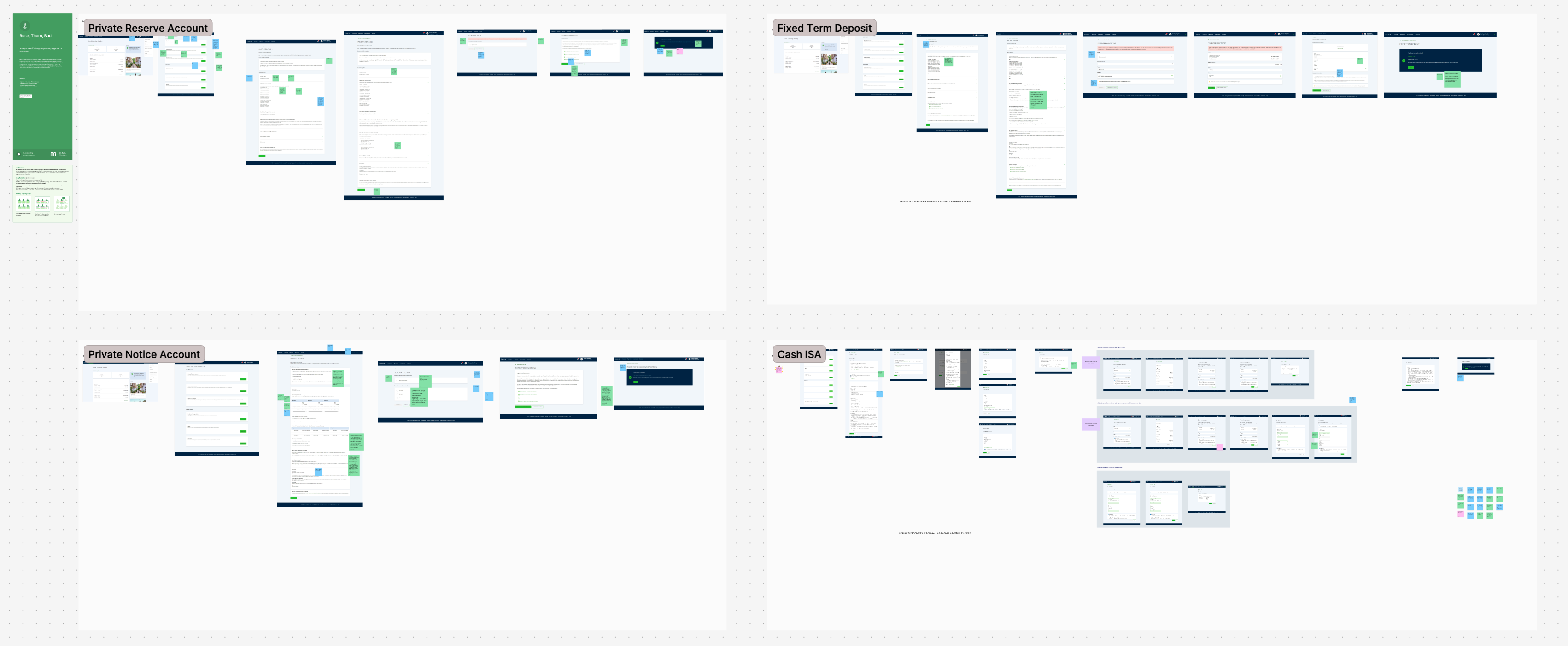
Four journeys, each built in its own moment
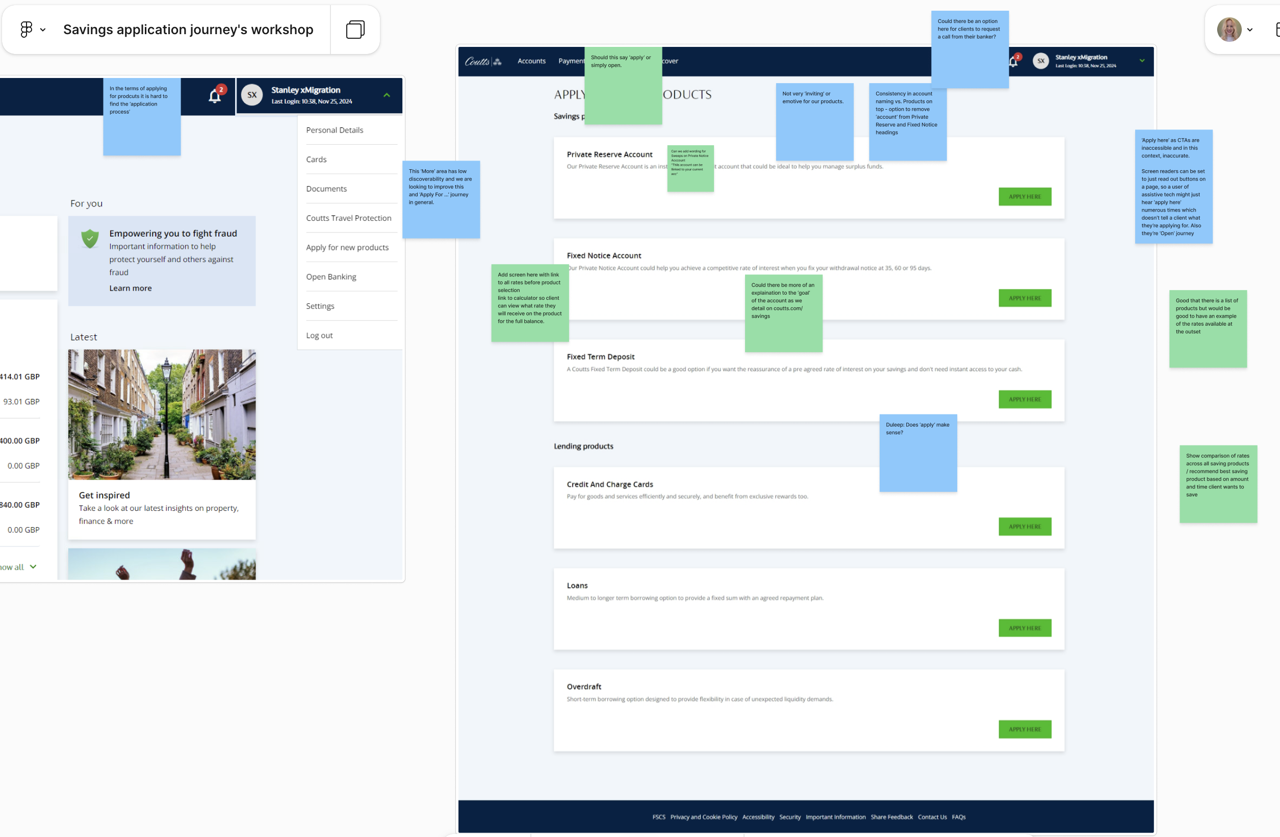
The Private Reserve Account, Fixed Term Deposit, and Cash ISA had each been built at different points by different teams. Terminology varied across them. Entry points worked differently. Summary box layouts weren't consistent. None of this was anyone's fault; each had been a reasonable decision at the time. Together, though, it added up to a savings experience that felt like four separate products rather than one coherent offering.
I couldn't fix it all in scope, and given the trust concern, trying to wasn't necessarily right either. So I noted what I could see and started thinking about what would need to happen after.
The inconsistencies aren’t mistakes. They’re archaeology.
Proposing what came next
A structured proposal, not a list of problems
I came to the product owner with a specific ask: a cross-team workshop, structured around all four savings journeys, with a clear output. Not just observations, but something the savings team could use when deciding where to focus their budget. The goal was a prioritised backlog, not a presentation about design quality.
He was on board. I planned and ran the whole session.
Running the workshop
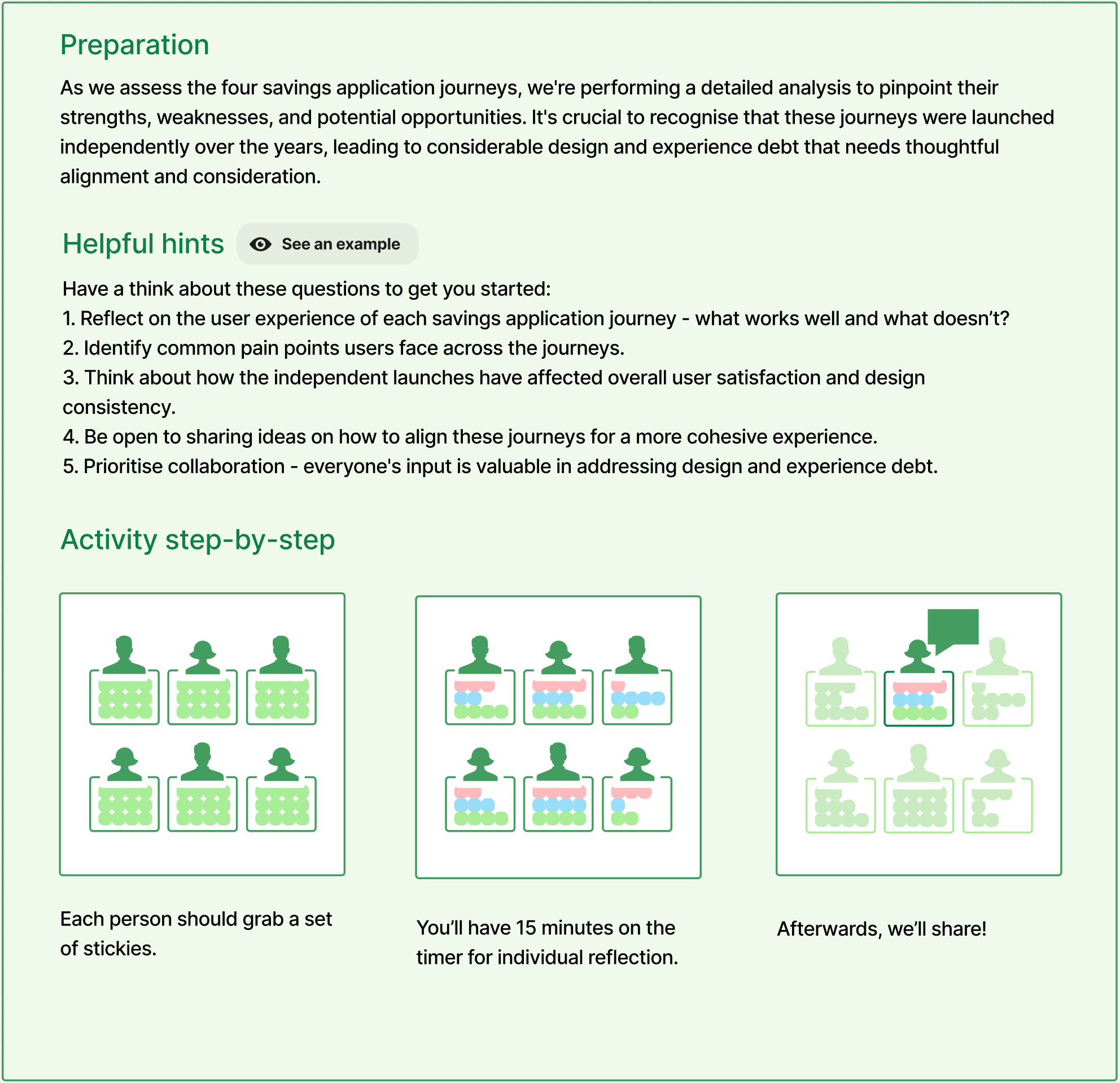
Rose, Thorn, Bud across all four journeys
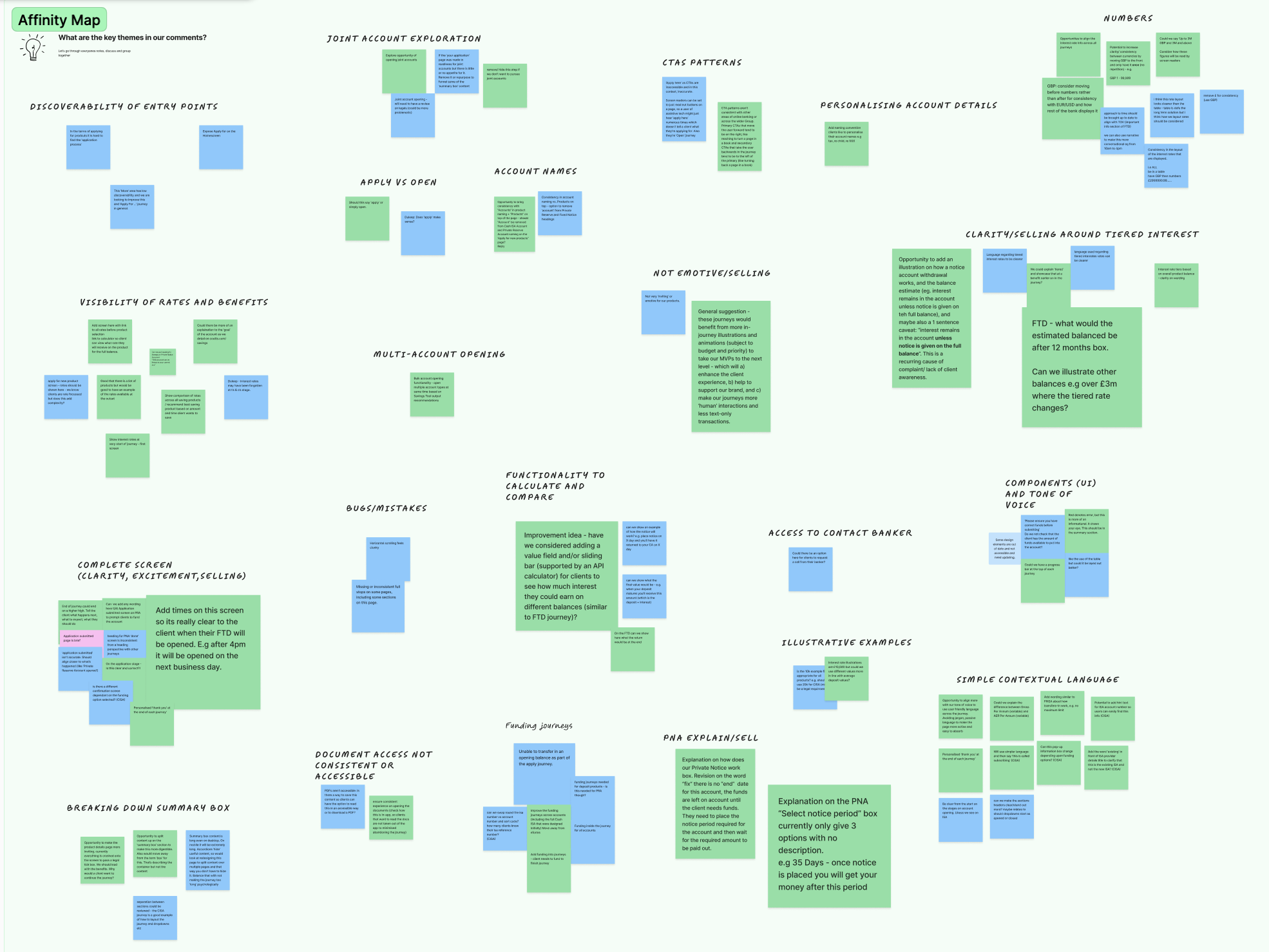
The workshop used the Rose, Thorn, Bud framework: each participant reviewing all four savings journeys and noting what was working, what wasn't, and what felt like an opportunity. Fifteen minutes of individual reflection, then shared. Keeping the structure light meant the conversation stayed on the journeys rather than on process.
Synthesis: affinity mapping then prioritisation
The sticky notes from the session were grouped into an affinity map, clustering findings under themes that emerged from the data. Themes included discoverability of entry points, visibility of rates and benefits, multi-account opening, contextual language, PDF accessibility, and illustrative examples. Once the themes were stable, they went onto an Importance/Difficulty matrix so the team could see, at a glance, where to start.
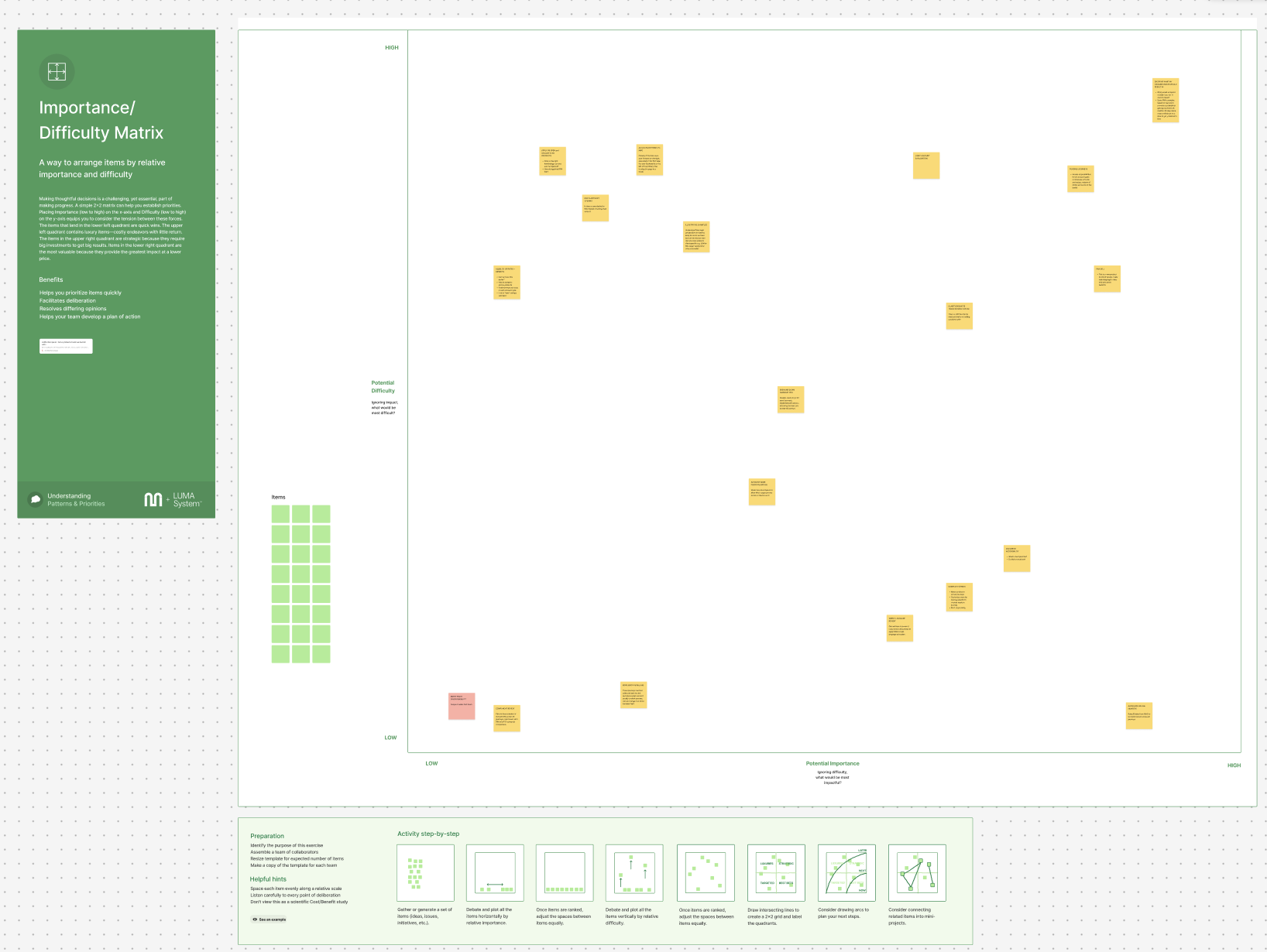
Top half = high impact. Left side = quick wins.
What came out of it
The backlog items fell into two groups: things that could move quickly with focused effort, and things with higher returns that needed more investment to get right.
Quick wins
Entry point
discoverability
Users who didn't already know where to find savings products in the app missed the entry points entirely. The products existed; they just weren't surfaced where people looked.
A navigation change with immediate reach impact; no redesign of the journeys themselves required.
Post-application
language
Every journey ended with "application submitted" when savings accounts actually opened instantly through straight-through processing. There was no review stage. Users had no way of knowing it was already done, or what to expect next.
Copy change with disproportionate confidence impact. Customised per product type to reflect actual processing: "ready in your accounts list within a couple of minutes."
Account naming
in the opening journey
Accounts could be named, but only through a settings edit most users never found. Research confirmed the edit step had almost no usage. Naming an account during opening creates immediate personalisation and a stronger sense of ownership from day one.
Low build cost. The pattern already existed; it just needed moving into the right moment in the flow.
High value, higher effort
Fund
mid-journey
An empty savings account generates no revenue, skews product data, and starts the client relationship on weak footing. Users are significantly more likely to make an initial deposit at the moment of opening than at any later point. Once the account exists with nothing in it, the momentum is gone.
The highest-returning item on the backlog. A commercial imperative as much as a UX one.
Tiered rates and
illustrative examples
Coutts' tiered interest rates are a genuine product advantage: when a balance moves into the next tier, the higher rate applies to the whole balance, not just the new portion. That distinction wasn't landing. Users also had no way to see what their own numbers would look like over time.
This became a standalone project and shipped on the Coutts dot com site. In-app delivery to follow.
Legal summary
box, redesigned
Previous designers had taken legal's briefing at face value. Pushing back and reading the actual legislation revealed considerably more flexibility than assumed. Consumer Duty reinforced the case: dense legal language reduces comprehension, which runs counter to the regulation's intent. The improved version was delivered for the Notice Account.
Needs applying to the other three products. High effort because it requires legal engagement for each; high value because it affects every journey at the point of decision.
The brief was to ship the journey. Everything after that came from deciding that shipping it wasn't enough.
Outcome
The backlog gave the savings team something concrete to work from when deciding where to focus next. Funding mid-journey sat at the top. Before the workshop, those decisions were being made based on whatever came up; afterwards, there was an actual list with a rationale behind it.
No one was going to listen to me talking about design problems across four products I hadn't shipped anything for. Delivering the Notice Account first was what made the rest of the conversation possible.
Trust is a design constraintIn private banking, consistency across products isn't just aesthetic. Users' confidence that they're dealing with the same institution is part of the product. Knowing when not to diverge is as important as knowing when to push.
Delivery is the starting point, not the endThe shipped journey opened a window onto a wider problem. Proposing the workshop after delivery, rather than waiting for someone else to scope it, is what turned an observation into something the team could use.
A backlog is a design outputThe most durable thing to come out of this work wasn't a screen. It was a prioritised view of what the savings team should tackle next, and a shared framework for making that call.
A note on confidentiality: screens have been kept at low resolution and some details generalised.