At a glance
No UK bank had a fully digital joint loan application. Every existing journey required a branch visit, a posted form, or both.
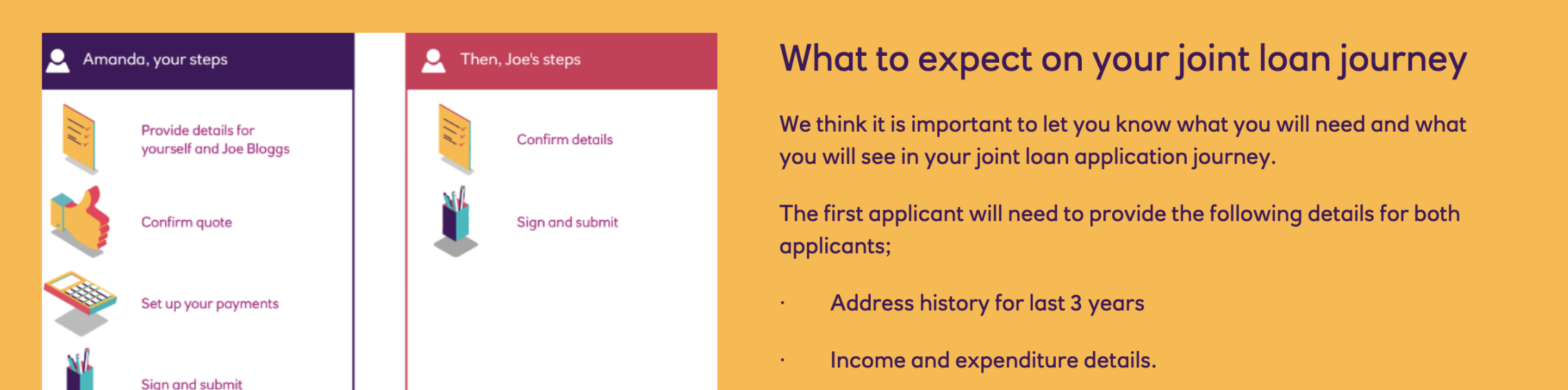
I designed a handover flow: Applicant 1 does around 90% of the work, signs, and passes the device. Applicant 2 reviews a summary, gets their version of the legal documents, and signs. It launched and is live.
The move that made it work was designing around what research kept showing: joint applicants almost never sit at the same computer at the same time.
at a UK bank
with real couples
by Applicant 1
Context
In 2022, applying for a joint loan at most UK banks meant going into a branch with your partner, or posting signed documents. Single-applicant loans had gone digital long ago, but joint loans hadn't. The regulatory weight was heavier, the edge cases messier, and the legal teams cautious.
I was part of NatWest's account opening team (a retail bank with 20 million customers in the UK) and took the brief to design a fully digital journey, constrained to two existing NatWest account holders. Non-customers were out of scope.
of consumers want to self-serve digitally when applying for loans
YouGovThe problem
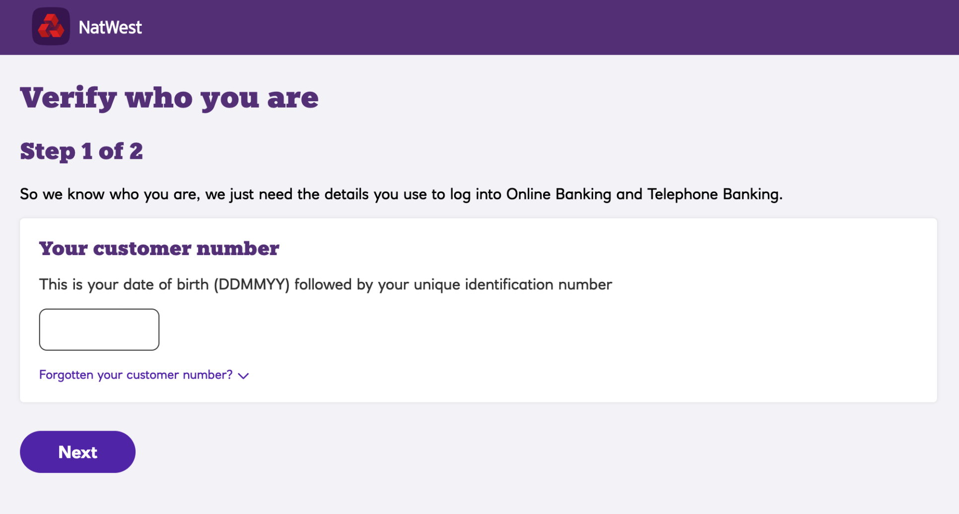
The obvious design problem was how to let two people sign one application online without a branch visit. The less obvious one was this: a branch visit is a trust mechanism. A colleague verifies identity, witnesses consent, handles the moment where two people commit to something legally binding together. Replicating that online, without creating friction that broke the journey, was the real design challenge. Online, you can't just ask the second person to confirm it's them (fraud risk is too high), so they have to log in. That constraint shaped a lot of the design decisions that followed.
The harder problem, which emerged during research, was that users and legal disagreed about what "secure enough" and "good enough" looked like, and each round shifted the balance.
Users were happy.
Legal wasn't.
Users found the journey simple and unremarkable (the compliment I was hoping for). Legal, reviewing it after the round, decided it wasn't secure enough. They'd verbally approved the direction, then changed their mind once they saw it tested.
Outcome: back to the drawing board with new legal requirements to absorb.
Legal was happy.
Users weren't.
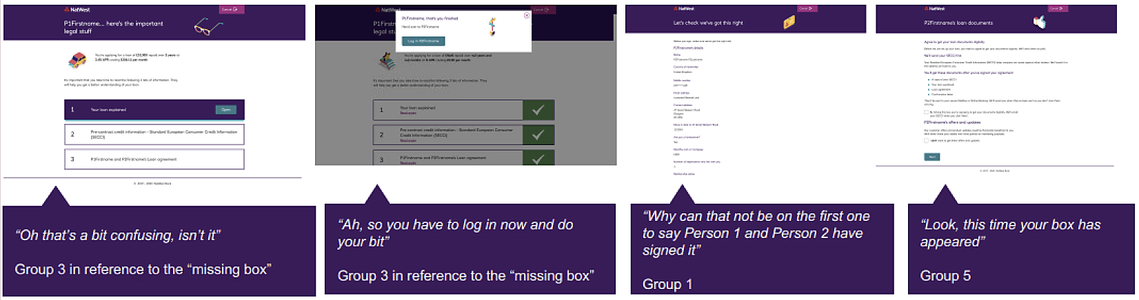
With legal's new requirements baked in, users found it exhausting. Too much switching between applicants. Both couldn't sign at the first stage, which confused people who expected to "sign together like in branch."
Outcome: a clear signal that the multi-handover structure had to go entirely.
Both were happy.
Journey launched.
After redesigning around the single hand-over pattern, users described the journey as quick and painless. Legal stayed comfortable. The flow went into build and launched live.
Outcome: first fully digital joint loan application at a UK bank.
Quick and painless.
Round 3 participantSo glad I don't have to go into a branch.
Round 3 participantMy partner doesn't have much free time so this means I can do it all and they can just sign it.
Round 3 participant, the one I was hoping for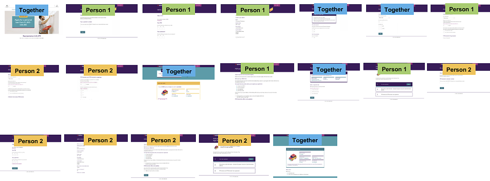
3 colours = 3 applicant states. Blue: together. Green: Person 1. Yellow: Person 2.
Every colour switch is a handover. Every handover is a login.
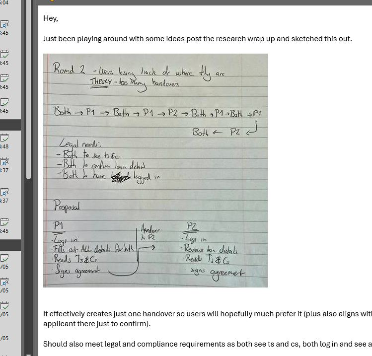
One handover instead of many. The reasoning written before any wireframe.
My approach
Let research be the argument
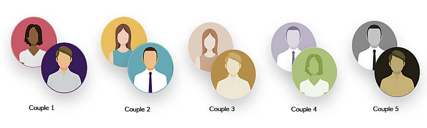
Research ran fully remote during COVID, which turned out to be the most useful constraint of the project. Instead of hearing about users' home lives in abstract, we watched them. Kids screaming in the background. One applicant in the kitchen, the other in another room, called over only when strictly necessary. Half-finished cups of tea and laptops balanced on knees.
Legal, understandably, had been imagining the default scenario: two calm adults sitting side by side at a clean desk, both fully present, both equally engaged. That picture held up badly against what we were seeing every session.
I started bringing this directly into the legal conversations. Not as a complaint, but as a design input. If the real situation is "one person driving, the other available intermittently," the journey needs to work for that. It shifted the framing from "how do we force both users to do everything together" to "how do we let one lead while keeping the second legally protected."
Research also surfaced something consistent about device. When asked where they'd apply for a loan, users were clear: it was a "proper task," the kind of thing you'd sit down at a laptop to do properly. Nobody said they'd reach for their phone. That shaped a deliberate choice to optimise the journey for desktop and laptop rather than designing to accommodate every device equally.
If the real situation is one person driving and the other available intermittently, the journey needs to work for that.
Design around the hand-over, not around the togetherness
Every hand-over between applicants meant a log-in. So the fewer hand-overs, the less friction. The single-hand-over model wasn't just a behavioural insight. It was also the minimum-friction shape the technical constraint allowed.
Instead of asking both applicants to move through the form in parallel, I let the design match how it actually happens.
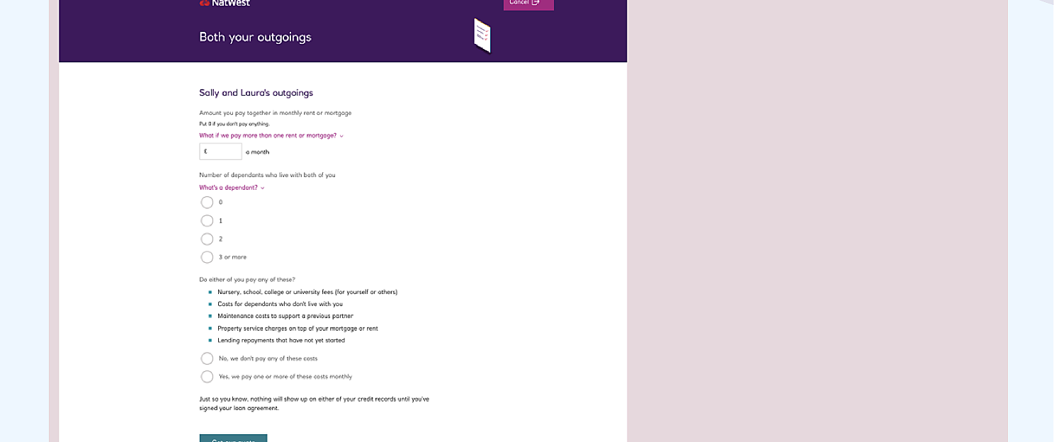
- Applicant 1 completes around 90% of the work. Name-tagged questions make it clear whose data is being entered at any moment, which came directly from a Round 1 insight.
- Applicant 1 signs their portion and hands the device over. Applicant 2 logs in.
- Applicant 2 sees a summary of what's been entered, their own version of the legal documents, confirms and signs.
- A joint confirmation page closes the loop.
To keep both applicants oriented through the hand-over, I worked with the wider account opening UX team in an ideation workshop and we landed on a "stagegate" component: a visual progress marker that showed each applicant where they were and what was still to come. Small thing, but it was what stopped Applicant 2 feeling parachuted in.
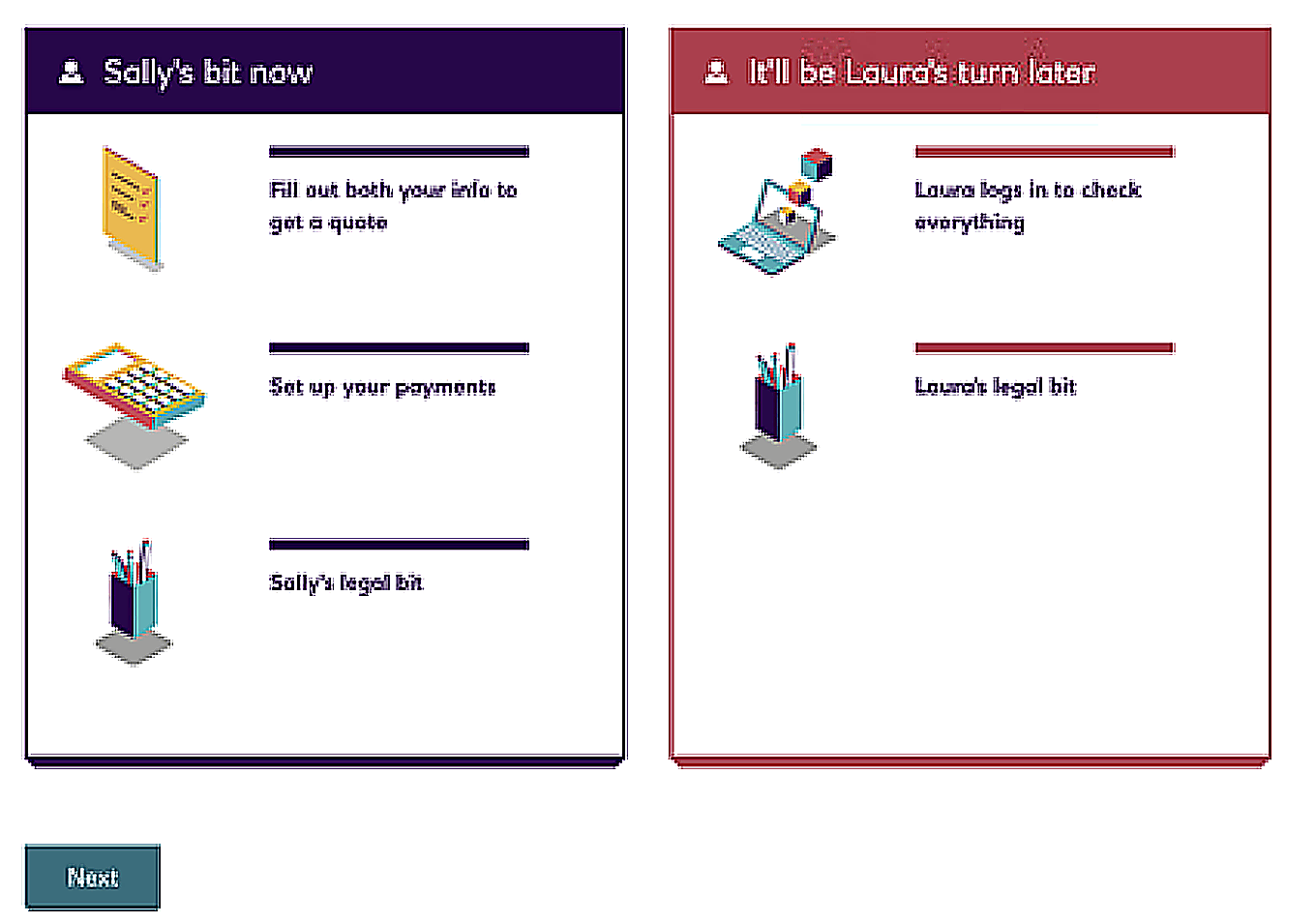
Applicant 2 sees their role before they’ve even logged in. No surprises at hand-over.
Get it in writing
The biggest process lesson from this project was about legal sign-off, not design. A verbal "we're happy with this direction" meant less than I'd assumed. After Round 1, I started documenting every legal decision in writing, getting it confirmed in email, and keeping a running log of what had been agreed and when. It slowed the early conversations and saved weeks of rework later.
A verbal 'we're happy with this direction' meant less than I'd assumed. Document every decision. Get it confirmed in writing.
Designed to work for everyone
The stagegate component was the most consequential accessibility decision. It would have been easy to build as a purely visual progress marker: position in the flow, colour, layout. Instead it used explicit text labels alongside the visuals, so both applicants could stay oriented regardless of how they were accessing the page. The name-tagged questions ("Sally's details," "Laura's details") had the same logic: clear context that worked for screen reader users and felt natural for sighted ones. When accessibility and usability point in the same direction, you've made the right call.
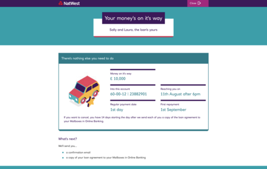
The confirmation was a considered moment, not just a summary screen. The copy "Sally and Laura, the loan's yours" names both applicants and uses a warm, personal register rather than a transactional one. The car illustration was a deliberate choice to mark completion as an event worth acknowledging. In banking the space for delight is narrow; you can't be playful with someone's finances. But the end of a completed journey is one of the few moments where it's entirely appropriate, and it was worth using well.
Outcomes
The journey launched as the first fully digital joint loan application at a UK bank. The hand-over structure remains live today under NatWest's current branding. Business priorities shifted the go-live timeline after the design completed, and I'd moved on by then, so I don't have post-launch performance data to share.
The significance wasn't primarily in the product metrics anyway. Journeys like this one were part of how NatWest was actively repositioning itself, moving away from a bank where important life moments required a branch visit, towards one built around how people, families and businesses actually live. Being first to market on digital joint loans wasn't just a product milestone. It was a signal about the kind of bank NatWest was becoming, and this project was a tangible part of making that case.
Round 3 testing was the clearest positive signal of the project itself: applicants described it as "quick and painless" and specifically valued being able to let one person lead.
Designing for real life, instead of the idealised version legal had in mind, was what turned a stuck project into something that felt warm and easy.
Real behaviour beats assumed behaviourThe hand-over pattern only worked because research showed us what legal couldn't picture: two people rarely sit at the same computer at the same time.
Research is your argument with stakeholdersBringing session clips into legal conversations shifted the framing from "how do we force both users together" to "how do we let one lead while keeping the second protected."
Get it in writingA verbal "we're happy with this direction" meant less than assumed. Documenting every legal decision, confirmed in email, saved weeks of rework.
A note on confidentiality: Screens and interaction structure shown here are simplified representations. Specific product details have been generalised.