At a glance
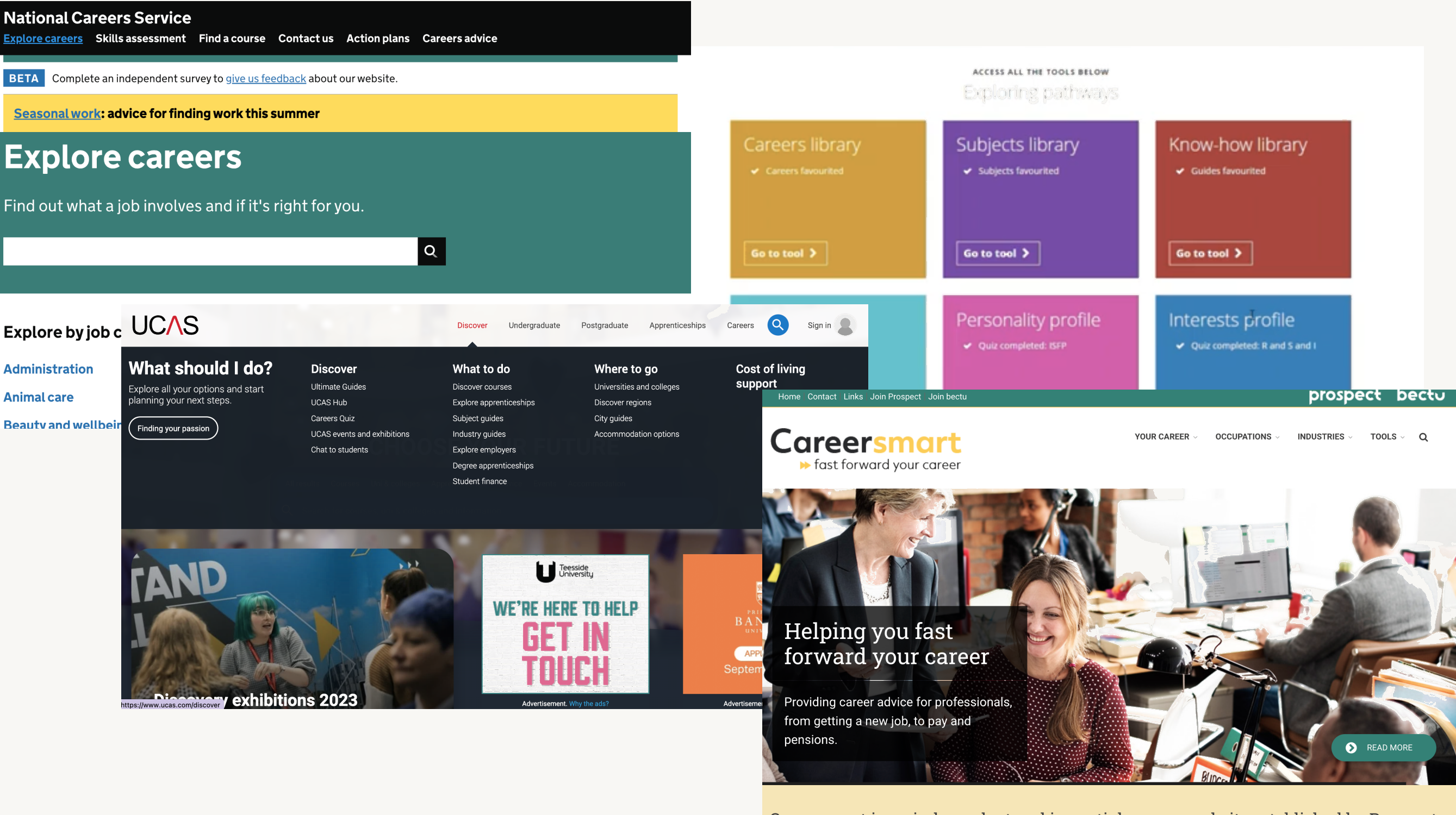
CareerSense is NatWest's programme for 13–18 year olds exploring routes beyond the default school-to-university path. Phase 1 had shipped fast to hit a deadline, with no research and heavy late-stage scope creep.
For Phase 2, I commissioned external user research across ages, genders and abilities. The clearest finding: the site wasn't one product with one audience. It was at least three, split by age, each needing different content and a different tone.
I restructured the site around age-based hubs and rewrote the IA to match.
genders and abilities
found in the data
variations delivered
The problem
Phase 1 had shipped fast to hit an in-school workshop launch. Influential stakeholders had added content late, priorities had shifted mid-build, and the homepage was trying to address thirteen-year-olds choosing GCSEs, sixteen-year-olds choosing A-levels, and eighteen-year-olds leaving school all at the same time.
Early feedback was a polite version of "This looks like it's for older kids." Younger users couldn't find themselves on the site. Older users found the tone a bit childish.
For Phase 2, I had a new business requirement (splitting into two regional brand variations) and, for the first time on this programme, a proper research budget.
My approach
Let research reshape the brief, not just the screens
Because NatWest couldn't interview under-16s in-house, I briefed and worked alongside an external research agency to run 31 user interviews across ages, genders and abilities. Under-16s were chaperoned with the camera off. Writing the brief and steering the agency was a useful project in itself, and the findings genuinely shifted the scope of the design work.
The site wasn't one product with one audience. It was at least three, split by age.

Three findings shaped the redesign directly.
Age was the
main axis
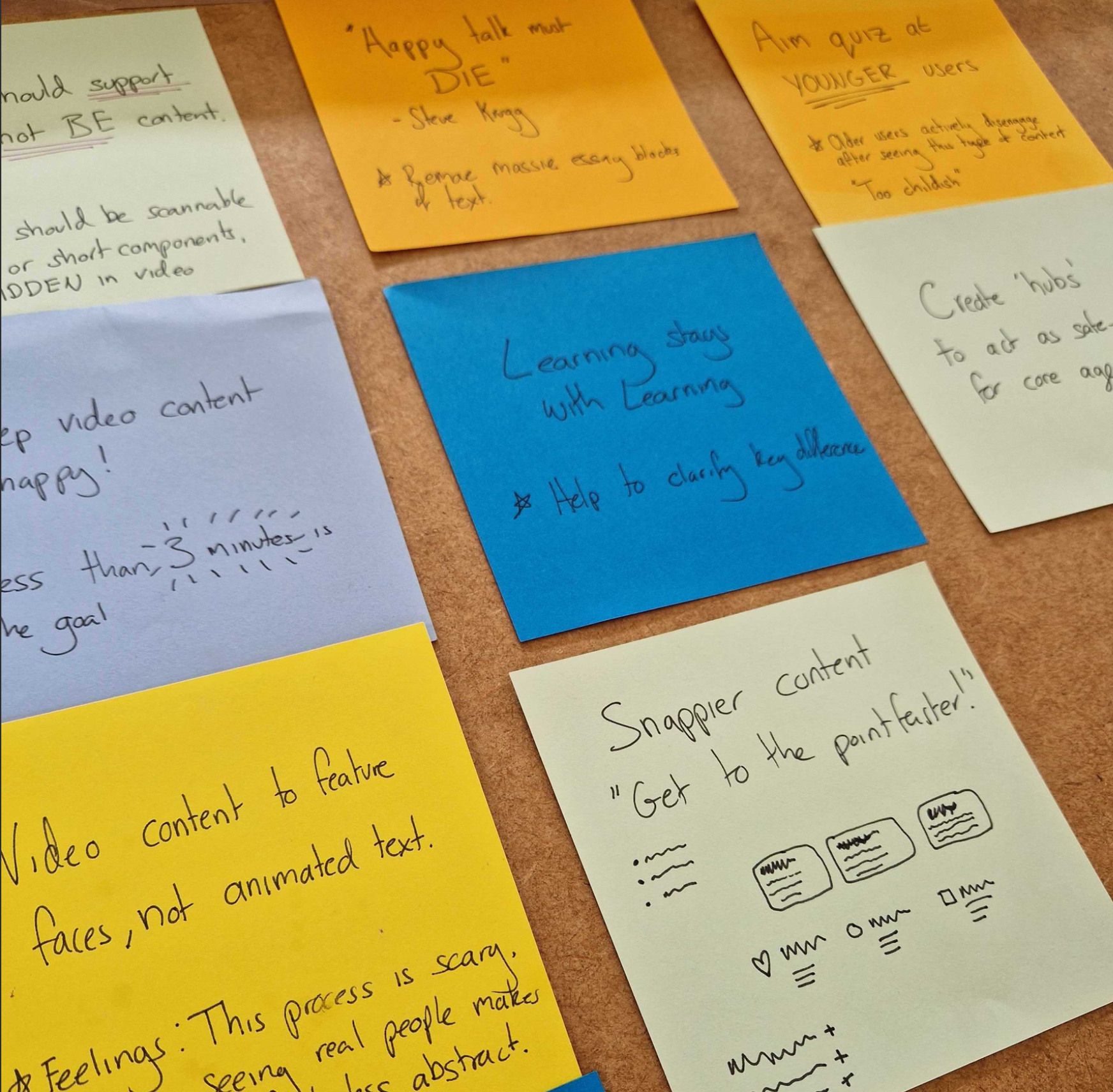
Younger users wanted quizzes and guided exploration. Older users wanted application steps and specifics, not more career inspiration. The same tone couldn't serve both.
Design implication: split the site into three age hubs, each with its own tone, content priorities and depth.
Traffic came
from workshops
In-school users only visited sites recommended by their school. Most arrived via the workshops themselves, not organic search. The site didn't need to work for strangers. It needed to work for people who'd met it an hour earlier.
Design implication: optimise for re-entry and follow-through, not first impressions from cold.
Scannable beats
promotional
Users engaged with bulleted tips, short testimonial videos under three minutes, and scannable sections. Long promotional paragraphs were skipped entirely regardless of how good the content was.
Design implication: restructure every page around the formats users actually read, and push back on long copy from stakeholders.
Accessibility from the start
With an audience that includes young people with a range of abilities, accessibility wasn't a late checklist. I engaged an in-house accessibility expert within NatWest Group early in the design phase. One of the clearest decisions that came out of that work: the video content on the site was designed to be supplementary, not the primary way to access any piece of information. Users with hearing impairments, or those in environments where they couldn't use audio, wouldn't be locked out of anything. The content itself was the experience; video added to it, not carried it.
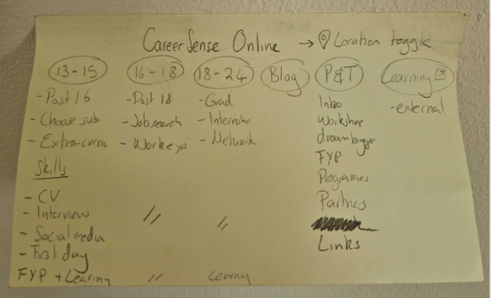
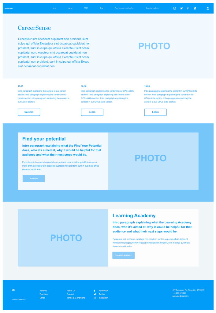
Redesign the architecture around age
Instead of trying to make a single homepage do everything, I restructured the site into age hubs, each with its own tone, content priorities and level of guidance.
- The younger hub leaned into exploration: quizzes, "what could I be?" paths, short clips from real people on different routes.
- The older hub leaned into specifics: how to apply, what qualifications you need, what an apprenticeship actually involves day to day.
- Parents and teachers got their own clearly signposted sections, so the main site didn't have to code-switch between talking to a teenager and talking to their mum.
- "Where to next" recommendations stitched each page to a relevant follow-on, so a user who landed on any page had a clear next step inside the site rather than a dead end.
Research finding, not assumption. 31 interviews pointed here.
The decision that couldn’t come from a brief: three sites, not one.
Use research as a shield against scope creep
Phase 1's scope creep had come from business stakeholders with an "oh, and add this as well" approach. The content itself came from the L&D team, who had a lot to say but no framework for deciding what to cut. I'd previously felt nervous pushing back, worried I was overstepping into decisions that weren't mine. Once research was on the table, the dynamic shifted. Evidence gave everyone a shared basis for saying no. Requests that couldn't be justified against what we'd heard from users didn't make it onto the page.
Evidence gave everyone a shared basis for saying no. Requests that couldn't be justified against what users told us didn't make it onto the page.
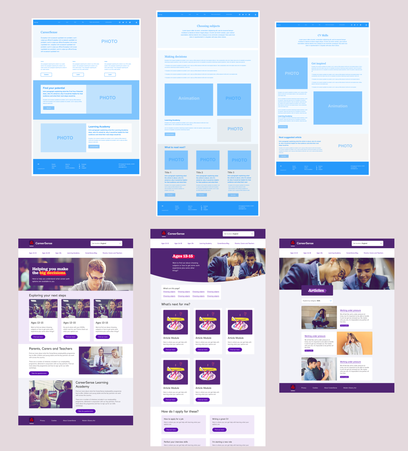
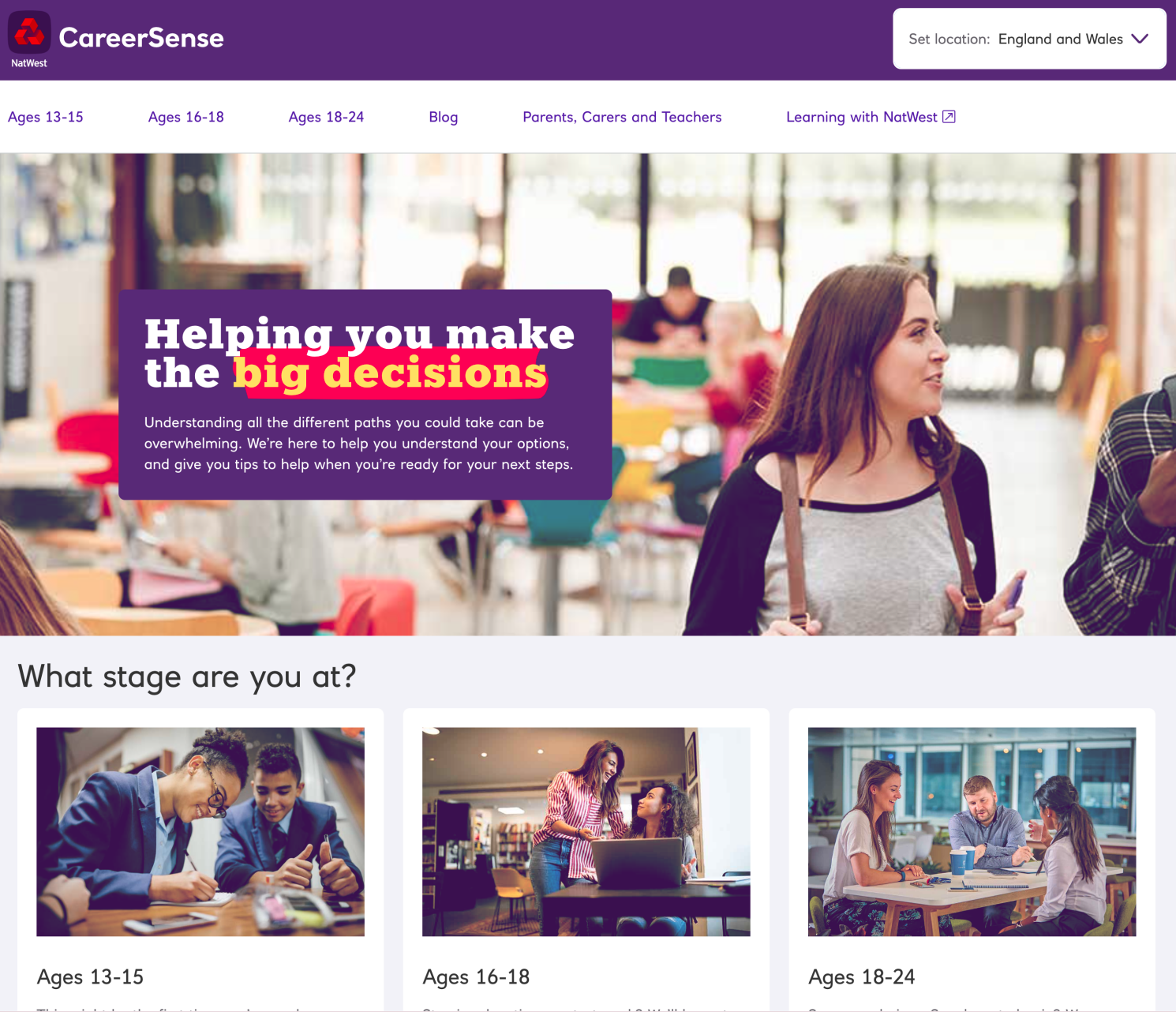
The nav bar is the whole IA decision, visible at a glance.
Outcomes and honest limits
The redesigned site launched in time for the new in-school workshops and ran as the live CareerSense site. The programme has since been rolled into a wider NatWest careers proposition.
One honest caveat: we didn't have time or budget for a second round of user testing before launch. I recommended it for the next cycle and flagged it clearly in handover. A case study that left that out would be dishonest about how real projects run.
The bit I'm proudest of isn't a screen. It's the idea that a young person could land on a page and feel, quietly, that it was actually for them.
Research reshapes scope, not just screensWithout the 31 interviews, the redesign would have been a single homepage trying to do the work of three. The evidence changed what the project actually was.
Research is the best defence against scope creepPhase 1's "add this as well" culture came from stakeholders with no shared criteria for what belonged. Evidence gave everyone a reason to say no that wasn't just opinion.
Content is interfaceWhat a fifteen-year-old sees on a career site shapes how they think about their options. Interface design and content design are the same problem.
A note on confidentiality: CareerSense has rebranded since. Specific examples have been generalised.