At a glance
Configuring a new administrator in Coutts' commercial platform required jumping across five separate areas of the system. One step had to be repeated for every account a client held. For organisations with hundreds of accounts, that was hundreds of repetitions.
I rebuilt it as a single flow, anchored around a pattern hidden in plain sight: 95% of new administrators need identical permissions to someone already set up. Copy from an existing user, confirm the exceptions, done.
Context
I work on a complex platform serving private, non-personal and commercial clients, many with complex organisational structures spanning dozens or hundreds of accounts and layered access requirements.
Internal colleagues use this journey to create and configure administrator setups. Those administrators then manage users within their own organisations. Permissions determine who can view a client's financial data, approve payments, and access accounts. Over-permissioned users represent a compliance and financial risk. Under-permissioned ones can't do their job. The stakes of getting it wrong are real in both directions.
The problem
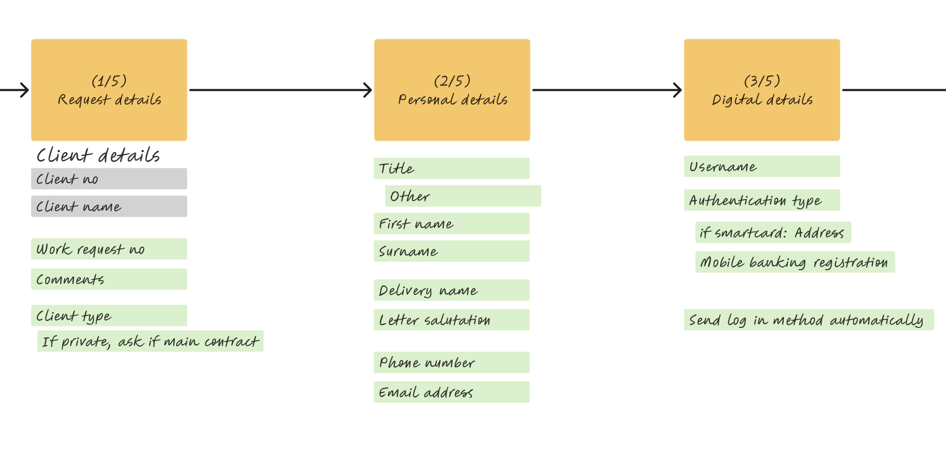
It takes too long, steps get missed, the system crashes between transitions, and there's so much learned behaviour that training a new colleague would be a nightmare. Setup spanned five separate areas of the system. Step four, configuring account access, had to be repeated for every account a client held. In the team's own words:
For every single account, we click the tiny link, click all five checkboxes, submit it, and then repeat for every single account the client has.
Alice, power user of the current systemFor organisations with hundreds of accounts, this was repetitive and mentally draining. More importantly, "user created" didn't mean "user ready." Configuration, approval and activation were spread across separate journeys, with no single place to confirm that the task was complete.
The question that reframed the brief. Written before any screen design.
User overview is the hub every task returns to. Not a journey. A loop.
5 separate systems collapsed into 1 linear flow. No hub to return to.
complete one setup
identical permissions
any number of accounts
My approach
Understand the problem, then break it down
Working with a Business Analyst and a legacy-platform SME, we mapped the full end-to-end setup process. Two problems emerged clearly: structural fragmentation at the journey level, and accumulated legacy debt at the individual screen level.
Rather than modelling everything at once, I stabilised a simplified base journey excluding permissions first, giving engineering a stable foundation while I unravelled the more complex permissions logic separately.
Rethink both what we ask and how we ask it
A field-level audit found inputs nobody could fully explain. Some were permanently disabled, always-on features that every user now gets by default: they couldn't be turned off, so they had no business being on the form at all. The site was littered with this kind of historical plastering over, each layer added at the time to solve a problem without removing what came before. Significant backend investigation was needed to establish what each legacy field actually did. Some were redundant and went. What remained also needed rethinking.
Many interaction patterns didn't reflect the underlying governance model.
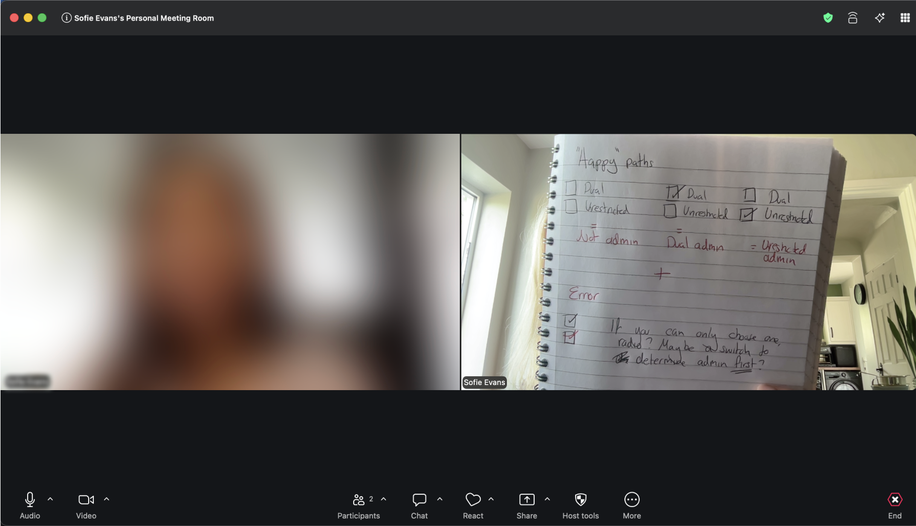
Example: Administrator status
Two options for setting admin status: Dual and Unrestricted. Only one could logically apply, but neither was also valid, for users who weren't administrators at all. That third state was hidden: you just left both unchecked and hoped you knew that's what it meant. Unrestricted added its own confusion: on a page full of permission toggles, it read like another permission you could grant rather than an administrator type.
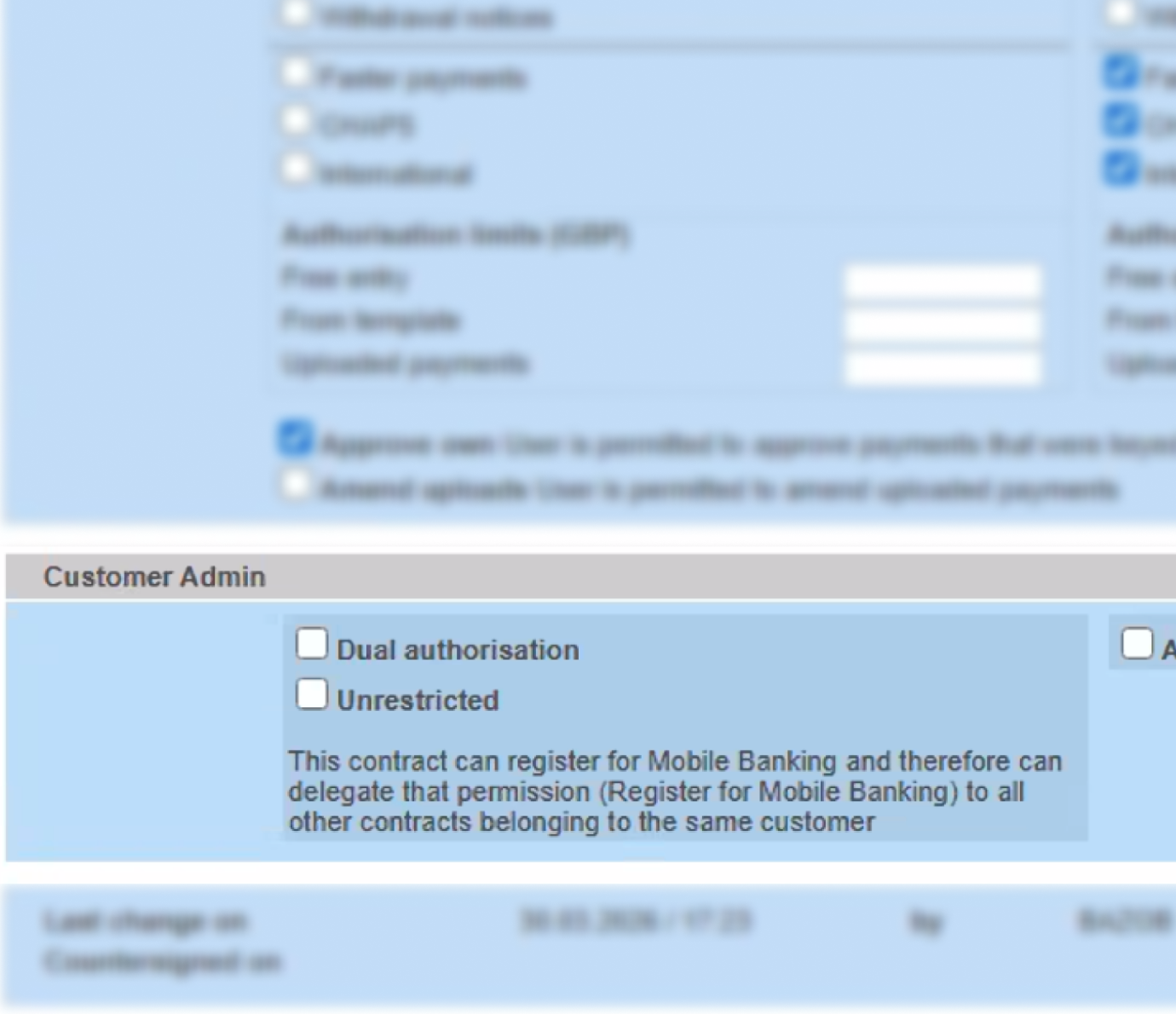
Both unticked = “not an admin”. Only if you already knew that.
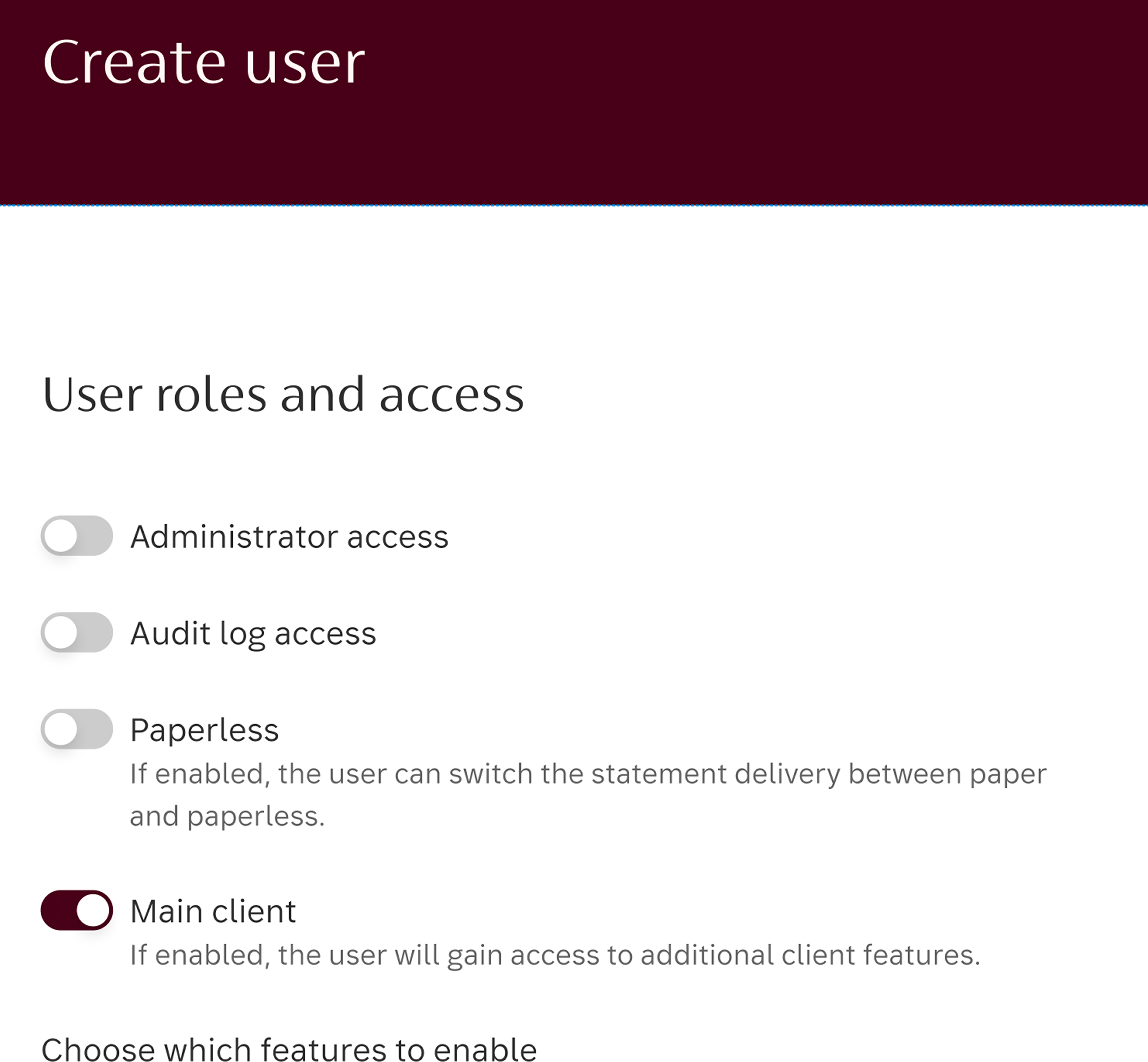
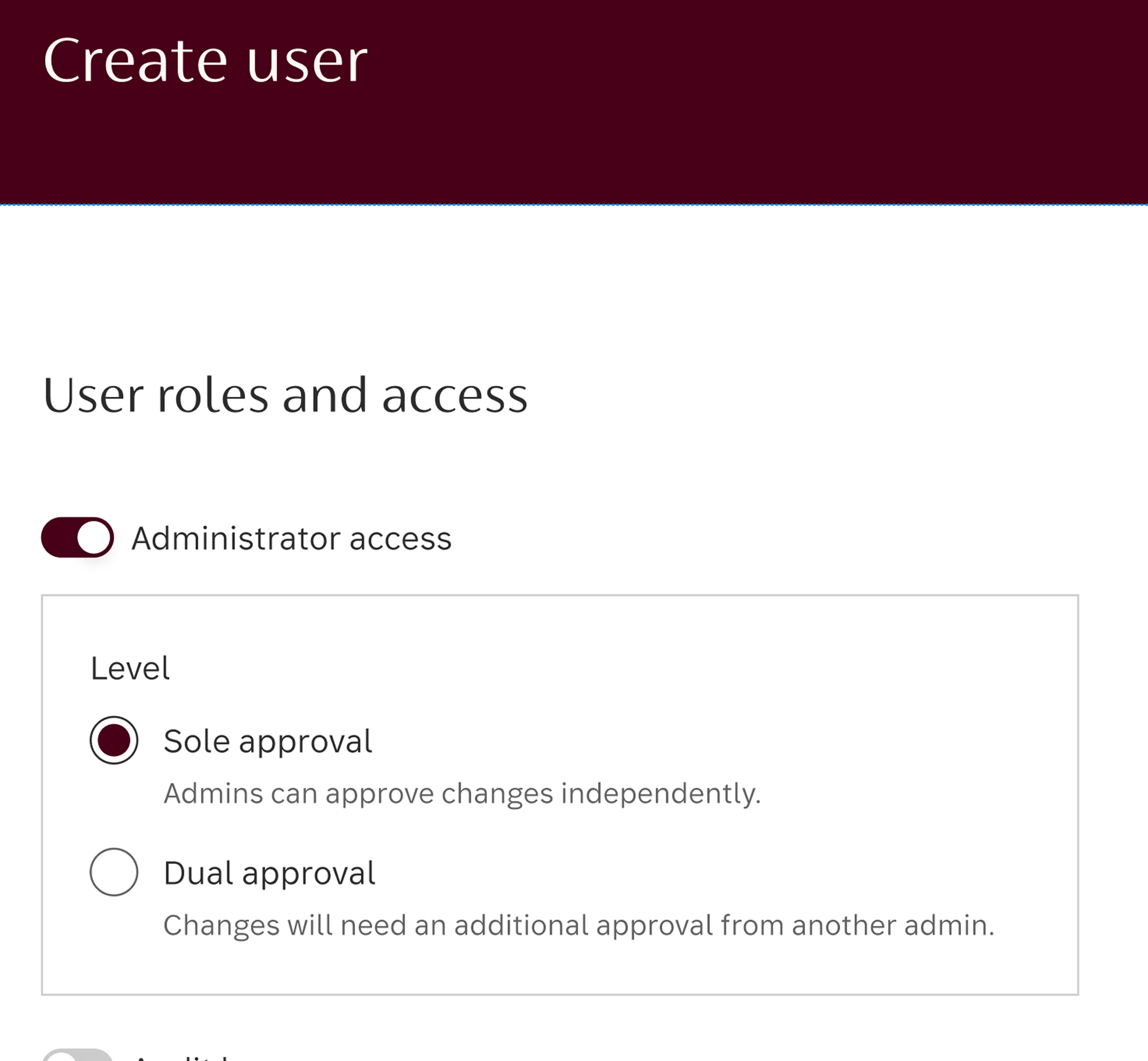
Off is now an explicit state, not an absence. Sub-options only appear when admin is on.
I renamed it Sole, which pairs cleanly with Dual and reflects what it actually means, and replaced both checkboxes with a single explicit three-option role selection: Sole, Dual, or not an administrator. All three states visible and deliberate.
Grey = existing system data, surfaced for context. Green = fields the colleague actually completes.
Listen for the pattern the system was hiding
I spent weeks in ongoing conversation with the team who live in this tool every day. The frustration they kept returning to was the account-by-account repetition. But the more important thing that emerged was a pattern the old UI had obscured:
Around 95% of the administrators being set up need identical permissions, at both user level and account level, to other admins already in the system. Only edge cases need bespoke configuration.
The old flow didn't know that. At user level, colleagues were manually working through a permissions list that was almost always the same: all off. At account level, they were repeating the same five clicks for every account a client held. The system treated every setup as unique, even when it was effectively identical to dozens already in place.
That insight became the foundation for the redesign of both pages.
Redesign around the 95% pattern
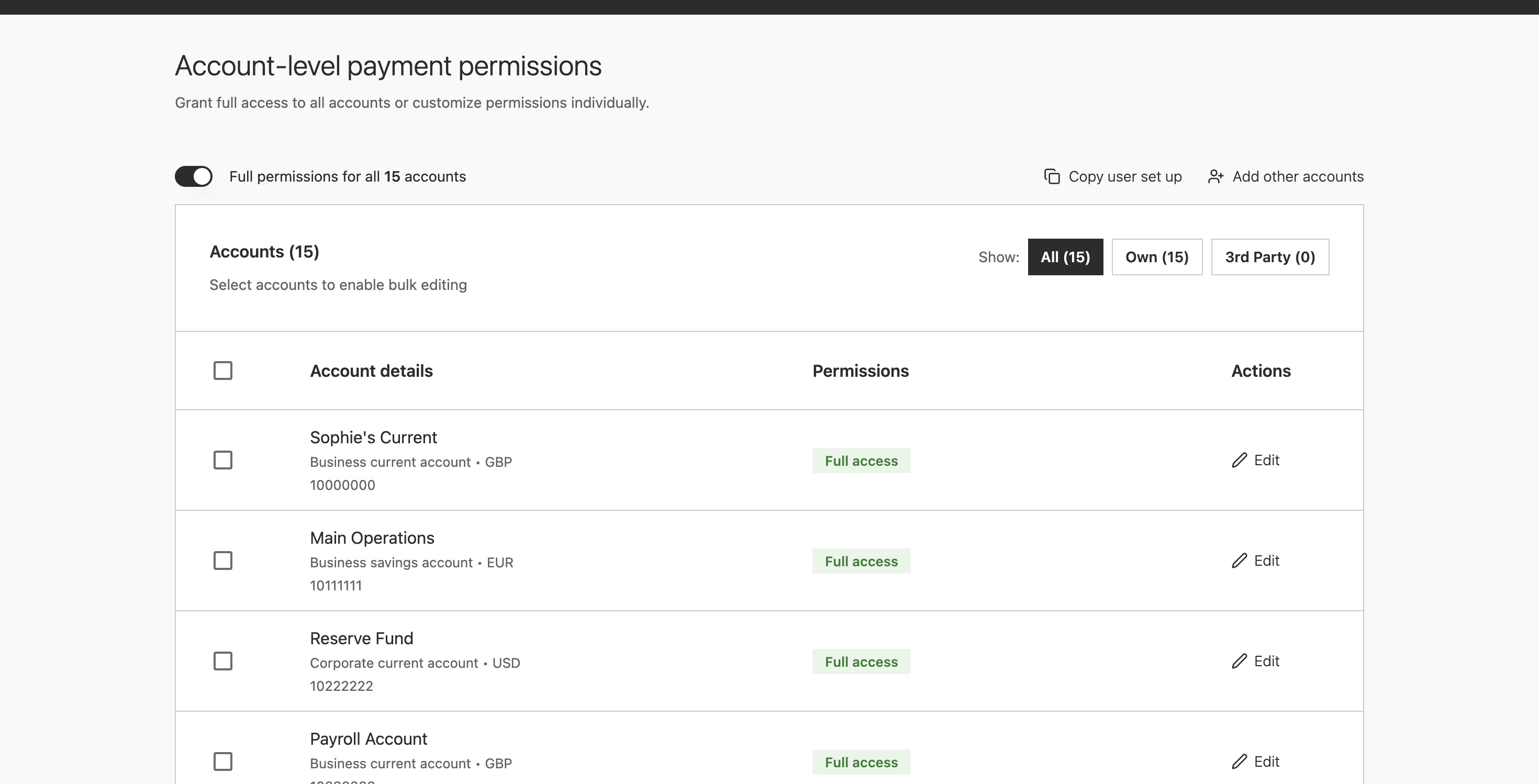
Once I knew the majority shape of the work, I could rebuild both permissions pages around it. The default stayed deliberately off throughout: over-permissioning has worse consequences than under-permissioning, so every permission granted should be a conscious decision.
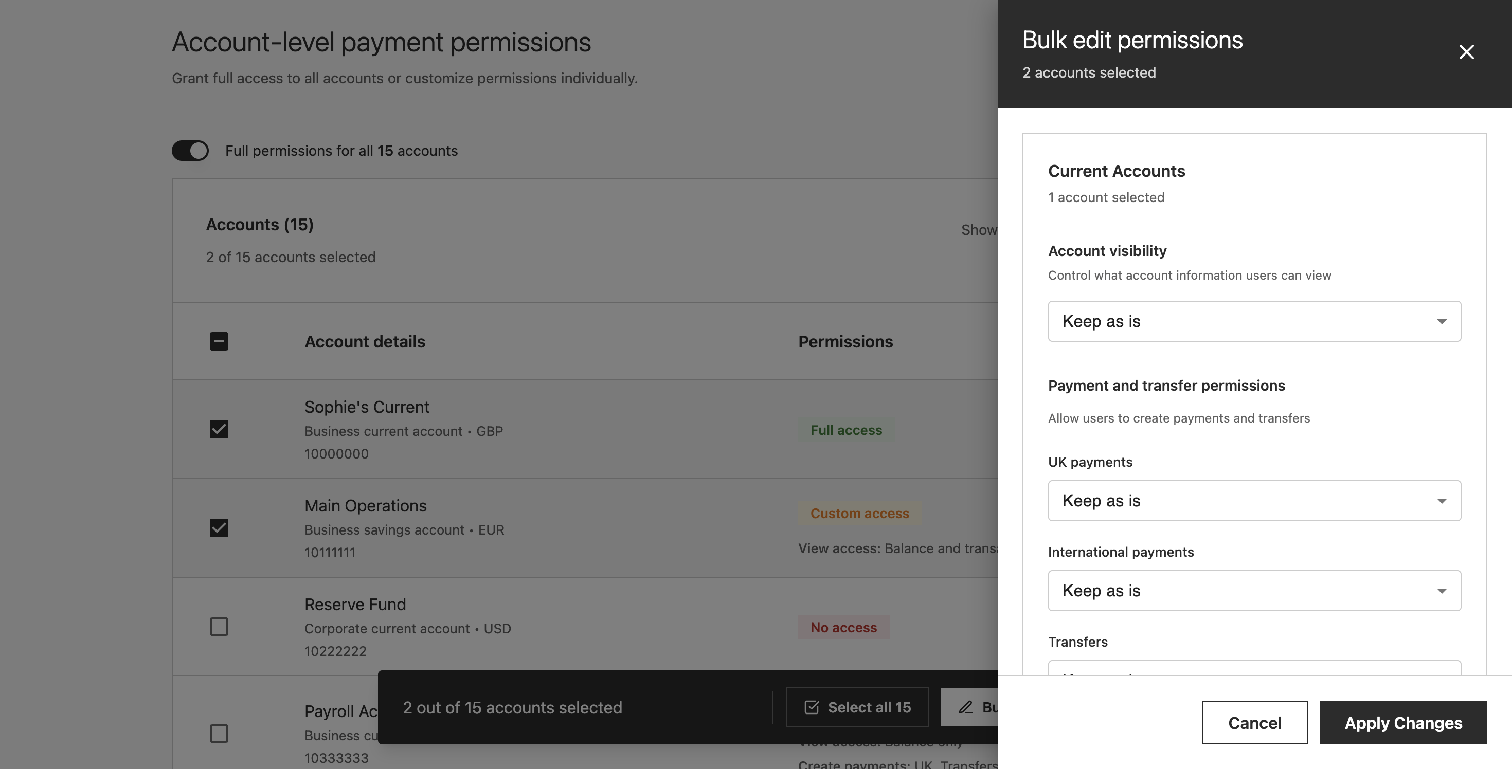
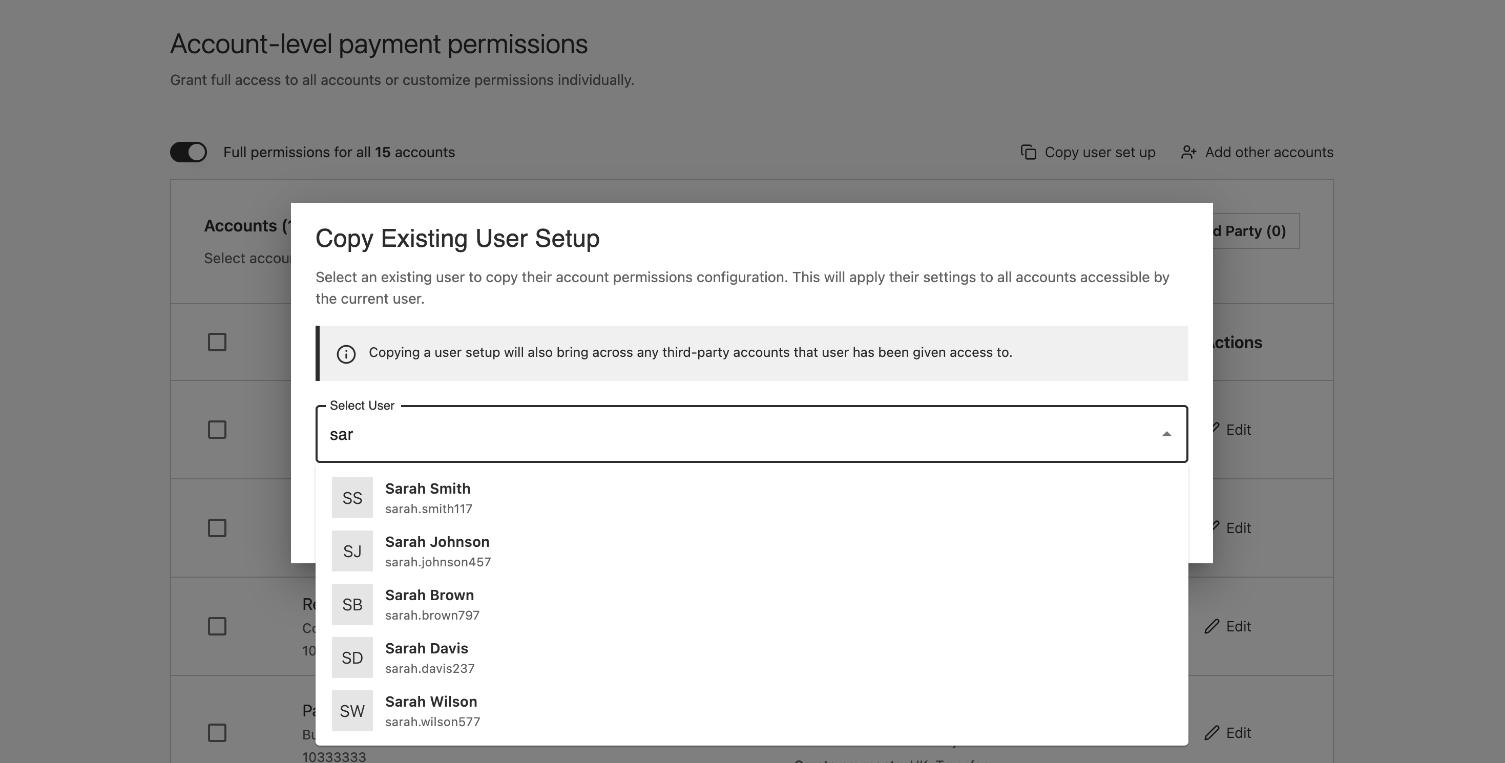
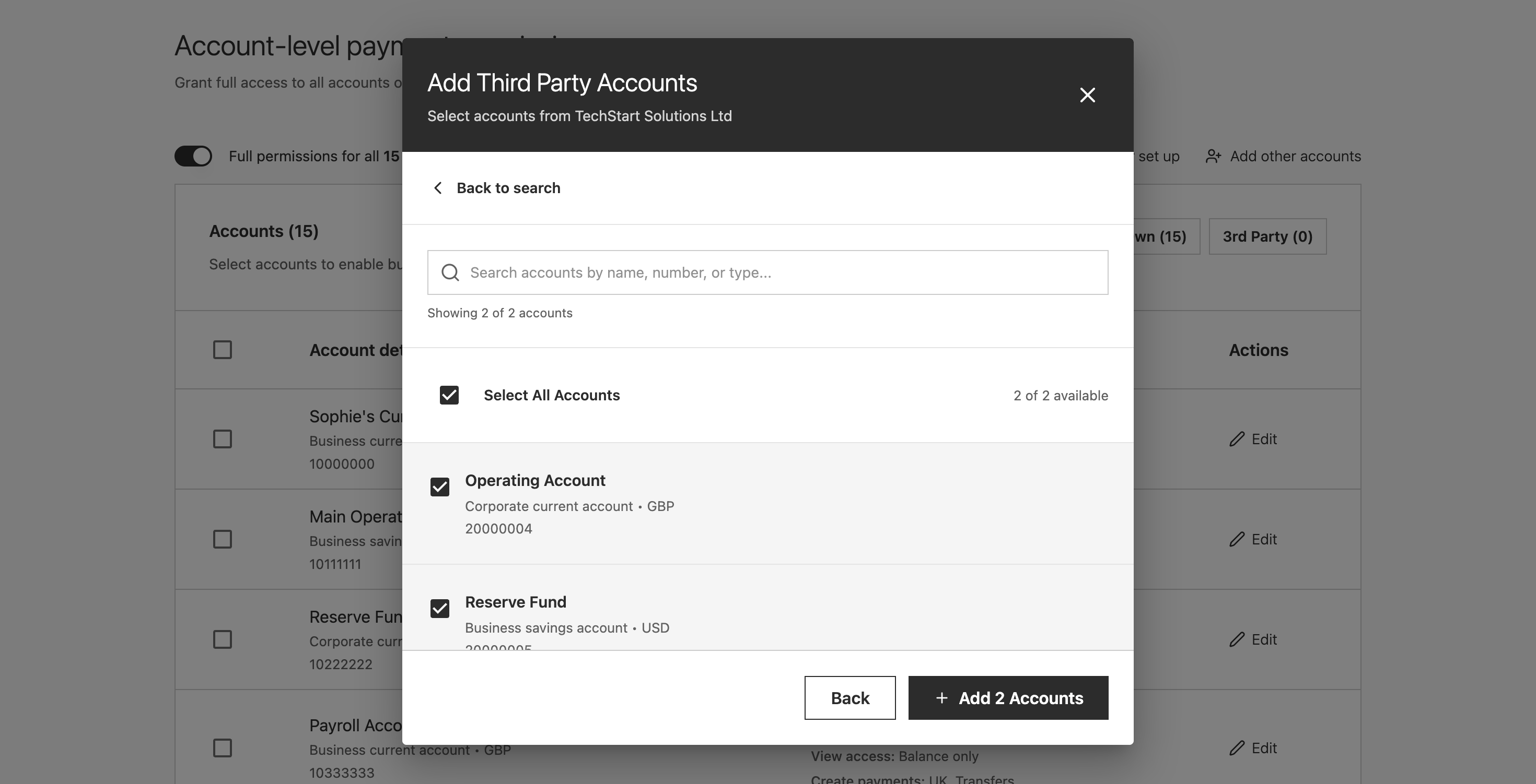
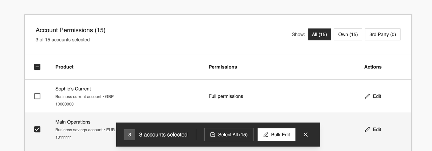
User-level permissions got a single full-permissions toggle: since the answer was almost always "all off", one action reaches the right state. Account-level permissions got four patterns, covering every scenario from the routine 95% to complex edge cases.
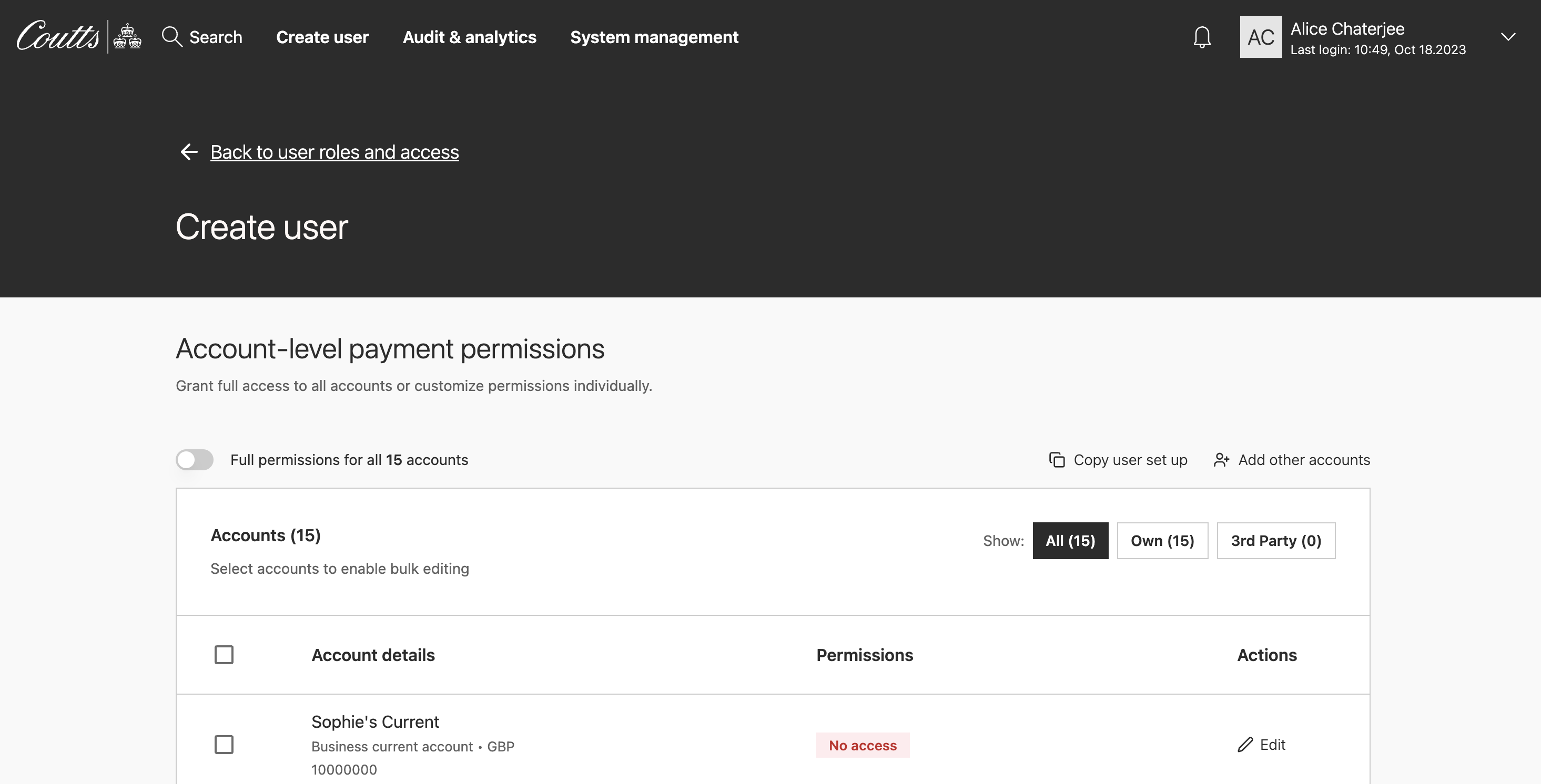
Full toggle. One switch for the 95% case.
Select any accounts. Bulk-edit applies to all at once.
Copy an existing user. Duplicate their full setup in one action.
Filter to 3rd party accounts. Bulk-edit reduced permissions for those only.
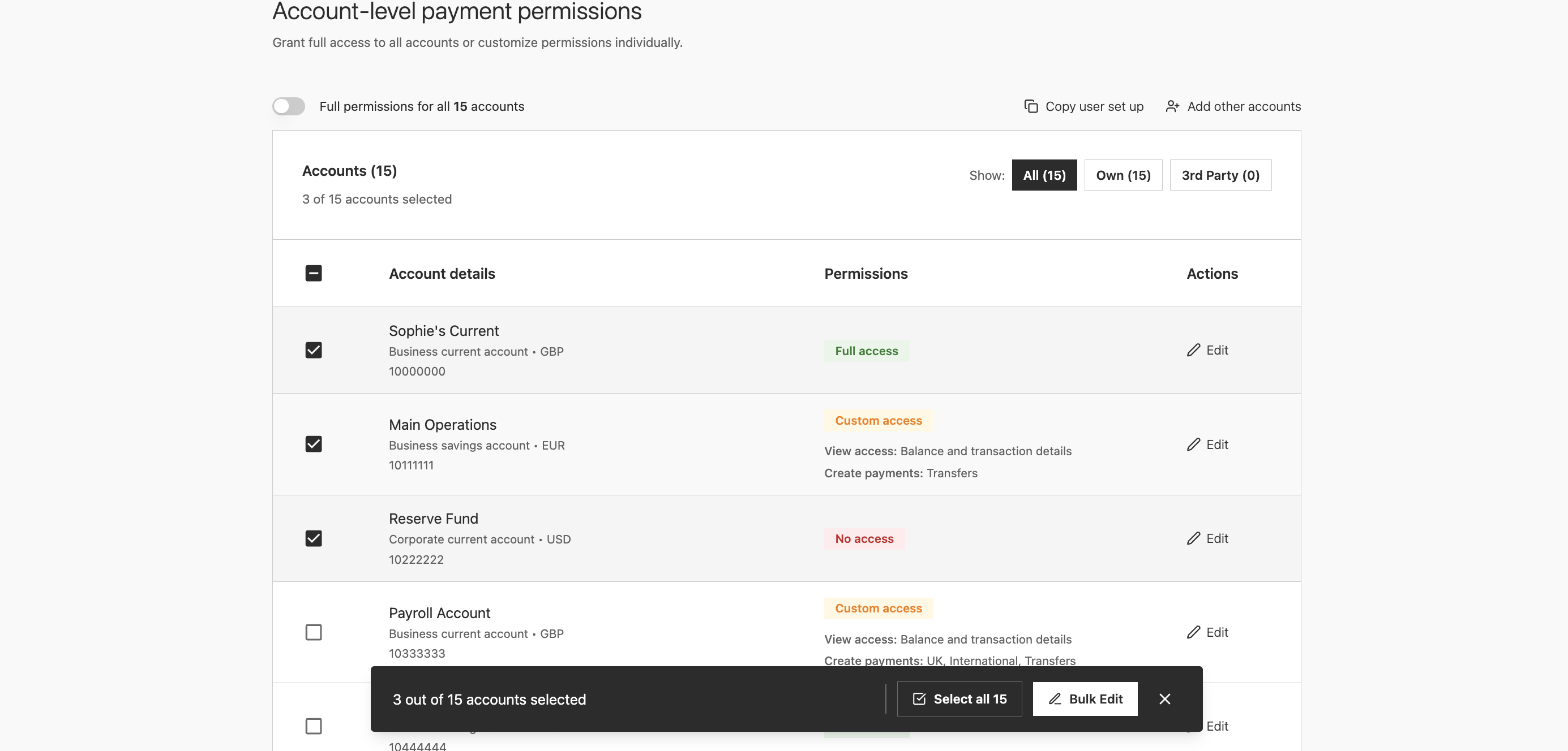
Bar only appears on selection. Zero noise when nothing is selected.
Prototype rapidly to validate
For ideas I didn't know would work until I could see them, building properly first would have been a real faff. Figma Make let me scaffold close-enough visuals quickly, test whether the direction worked, then invest the time to rebuild it properly once I knew it did.
When I walked the team through the interactive prototype, the colleagues who had lived with the old flow for years called it a complete game-changer. Development were on board too, so I moved straight into high fidelity having saved a significant amount of time getting there.
Collaborate across time zones, early and often
The engineering team spans India, Switzerland and the UK. Overlap is limited to mornings, so that's when we met: feasibility checks, edge case sessions, design QA. The rest was async, sharing work in progress early rather than waiting for something polished. The solution that reached build was shaped by those conversations, not just handed over.
Building a new component accessibly
The floating action bar didn't exist in the design system. Before anything went near engineering, I did extensive research into how this kind of pattern should work for keyboard and screen reader users, then collaborated with the lead on the design systems team to build it properly from the ground up.
Rather than creating something new from scratch, we built it from existing accessible components: the primary and secondary CTAs that already had the right keyboard behaviour and focus styles baked in. Accessibility was inherited rather than retrofitted, which is a meaningfully different thing.
A few decisions only became visible through that process. A floating bar sitting at the bottom of the screen can cover whatever row the user is currently focused on, so the bar's position and the table's scroll behaviour had to be thought about together. The fix was making the table treat the bar's footprint as occupied space, so focused rows always scroll into view above it rather than disappearing behind it. The selected count shown visually in "3 accounts selected" needed to reach screen reader users too, not just sighted ones. And when the bulk edit drawer closes, focus needed to return to the table, not drop the user back at the top of the page.
Trade-offs
Three trade-offs shaped the final design. Each was chosen deliberately rather than by default.
Simplification
vs flexibility
Around 95% of setups followed predictable patterns. The alternative was to optimise purely for the majority and push complex scenarios into a separate edit journey.
Chose: context-aware defaults with bespoke configuration available within the same flow.
Upfront investment
vs downstream efficiency
Rebuilding into a completion-focused flow required greater upfront effort. We could have kept a lightweight creation step and relied on separate edit and approval flows.
Chose: consolidate permissions, validation and activation into one flow. A secondary benefit: the create-user screens are reusable for the edit-user journey.
Editing flexibility
vs engineering effort
Ideally the summary screen would allow direct navigation back to specific sections. The edit action returns colleagues to page one of the form instead.
Chose: accepted the constraint. Colleagues are experienced users working from client forms; rework is expected to be low.
Outcomes
The broader journey redesign is in build, with phased delivery planned over the next 18 months. The step-four redesign was validated in prototype and is heading to engineering.
The time saving is significant enough to be worth naming. The old journey took roughly an hour: colleagues knew this, lived it, and said so directly. After seeing the prototype, those same colleagues estimated the new flow would take around five minutes. Five separate systems collapsed into one, the account-by-account repetition replaced by a four-switch bulk operation, handovers reduced, and the cognitive overhead of learned workarounds gone.
User-estimated setup time for the redesigned journey, down from a known ~1 hour under the old flow
Estimated by colleagues during prototype validationThe responses from prototype validation and design crit were direct enough to quote.
A complete game-changer.
Colleague, on seeing the bulk edit pattern for the first timeThis is something new. How did you iterate so quickly?
Designer, Coutts design critA note on confidentiality: Due to the sensitive nature of the platform, specific interface elements and data structures have been generalised in this write-up. Diagrams and screens shown represent interaction structure rather than production UI.
Complex systems work isn't about hiding complexity. It's about deciding where it should live.
Absorb complexity into logic, not interfaceThe wrong answer is to push it into the interface. The right answer is to absorb it into defaults and give the user a coherent, completion-focused task in return.
Design for the 95%, without abandoning the edge casesResisting the urge to make setup look simple by stripping capability. Making it feel simple by aligning the interface with how the task actually works.
The people who live in the tool are the best source of insightWeeks of ongoing conversation with the team uncovered a pattern the old UI had obscured entirely. No amount of analytics would have surfaced it.