At a glance
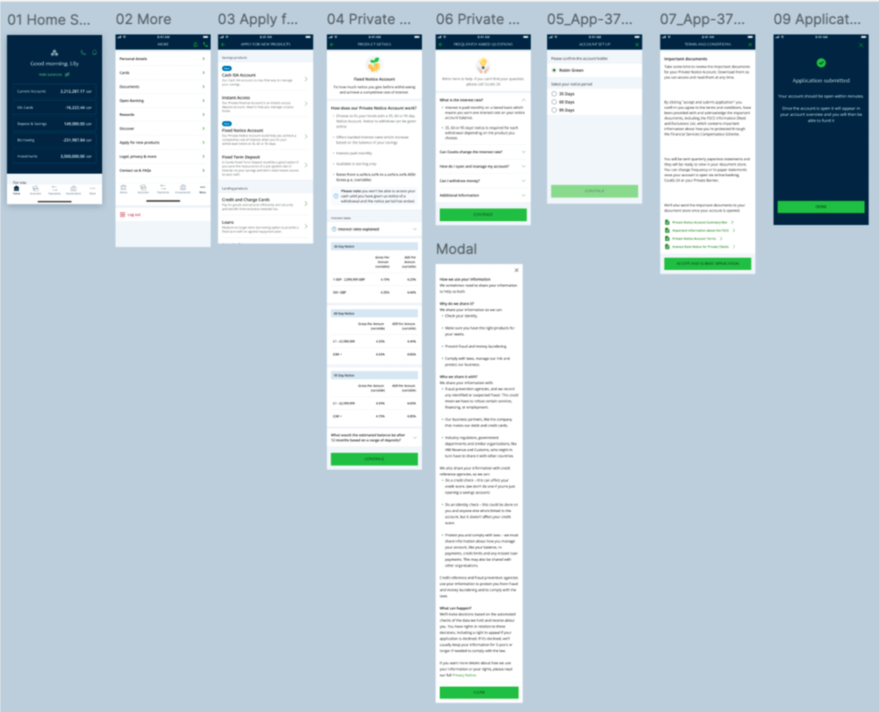
The brief was clear: design the Private Notice Account apply journey for web and app, reusing existing savings screens where possible for a fast delivery.
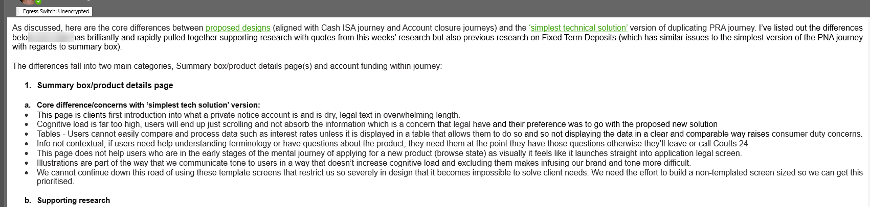
Working to deliver at pace, two problems became visible. The existing summary box didn't meet Consumer Duty's comprehensibility standards. Not just visually, but legally. Fixing it properly, though, would produce a journey noticeably different from the other three savings products. In banking, divergence from familiar patterns raises red flags. Industry scam education has deliberately trained customers to stop and question anything that looks unexpected in a banking flow. That's a good thing, but it means visual inconsistency carries real stakes.
The delivery required working out where those two constraints could coexist: what had to change, what had to stay, and what needed to wait. That last category didn't disappear. It became the foundation for a cross-product workshop and backlog that followed.
Within 12 months of launch: +64% balance growth and a 4× acceleration in growth rate vs the pre-digital period.
The brief
Without a dedicated digital apply journey for the Private Notice Account, applications were being handled offline. Product teams know that the absence of a digital journey is a wasted sales opportunity. Every unnecessary step costs completions. Getting something live quickly was the commercial priority.
Lift and shift was the pragmatic answer: reuse the screens that already existed across the other savings journeys and adapt where needed. Speed was the point. That it also gave clients a recognisable experience, familiar enough from the other savings products to reduce cognitive load at the moment of financial commitment, was a genuine design benefit on top.
The journey covered entry from the product listing, through product detail, terms and eligibility, through to submission. On both web and native iOS and Android app.
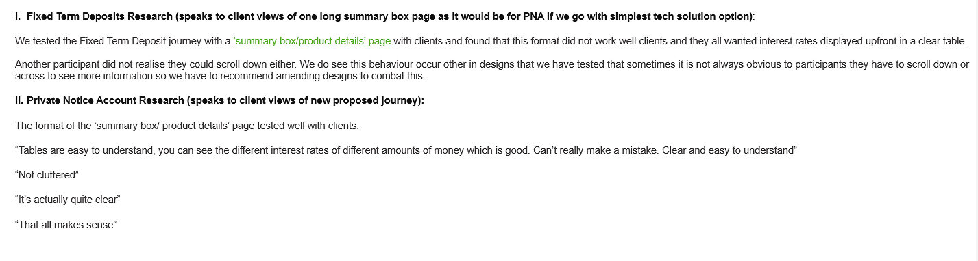
Client data and industry research both pointed in the same direction: mobile was how most clients would apply. That made mobile-first the right frame from the start, not a responsive afterthought. The existing savings journeys had been designed web-first and adapted for app, and it showed: too much content per screen, layouts built for a wider canvas, flows that worked on desktop but felt effortful on a phone. Designing mobile-first meant rethinking page density. It's one of the reasons the summary content was split across two screens rather than condensed onto one. A single dense screen might have been acceptable on web. On native mobile it would have repeated exactly the problem the old journeys had.
The Consumer Duty constraint
The summary box was the problem. Legal had always briefed designers on summary boxes as fixed: dense, precise, written in the language of the legislation. Previous designers had taken that at face value. A look at how every other major bank handled it confirmed the pattern.
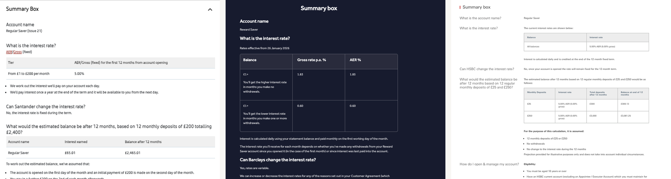
Dense, undifferentiated text
The rate, the conditions, the eligibility rules. All the same visual weight. Nothing is easier to find than anything else.
Rate buried mid-page
The number a client most needs comes after sections they didn't ask for. You scroll past conditions before you reach what you're committing to.
No design beyond compliance
HSBC shows the same rate table twice on one page: once for desktop, once for mobile. Nobody decided this was a good experience. It just happened.
Across all three: compliant, dense, and identical. Designed to satisfy a regulator, not to help someone make a decision.
Reading the actual regulation revealed considerably more flexibility than anyone had assumed. Consumer Duty places a clear obligation on firms to communicate in ways that customers can actually understand. A summary box so dense that clients couldn't parse what they were committing to wasn't just a design problem. It ran counter to the regulation's intent.
Something had to change. Working closely with product and legal through several rounds of review, the summary box became the significant piece of work inside this delivery.
The design work
The goal was language that was both legally accurate and genuinely readable, which turned out to be possible in most cases with effort and close collaboration with legal.
Summary box
across two pages
The original single screen combined rates, terms, and conditions in a dense format. Clients had to parse everything at once before they could commit. Splitting across two pages gave each element space to be understood on its own terms.
Legal precision and legibility aren't opposites. Getting both requires pushing back on the assumption that the briefing document defines the limits.
Contextual
support
Instead of assuming clients already knew what a "notice period" meant in practice, the redesigned journey surfaced explanations at the moment they were relevant, not buried in a glossary at the end.
Coutts clients are financially sophisticated, but sophistication doesn't mean product-specific terms should go unexplained. Clarity and expertise aren't in tension.
Visual
simplification
The rate tables were restructured to make comparisons scannable. Banded interest rates (where higher rates apply to the whole balance once a tier is crossed, not just the portion above) were presented in a way that made Coutts' actual product advantage legible.
A genuine product advantage, previously hidden by the existing presentation format.
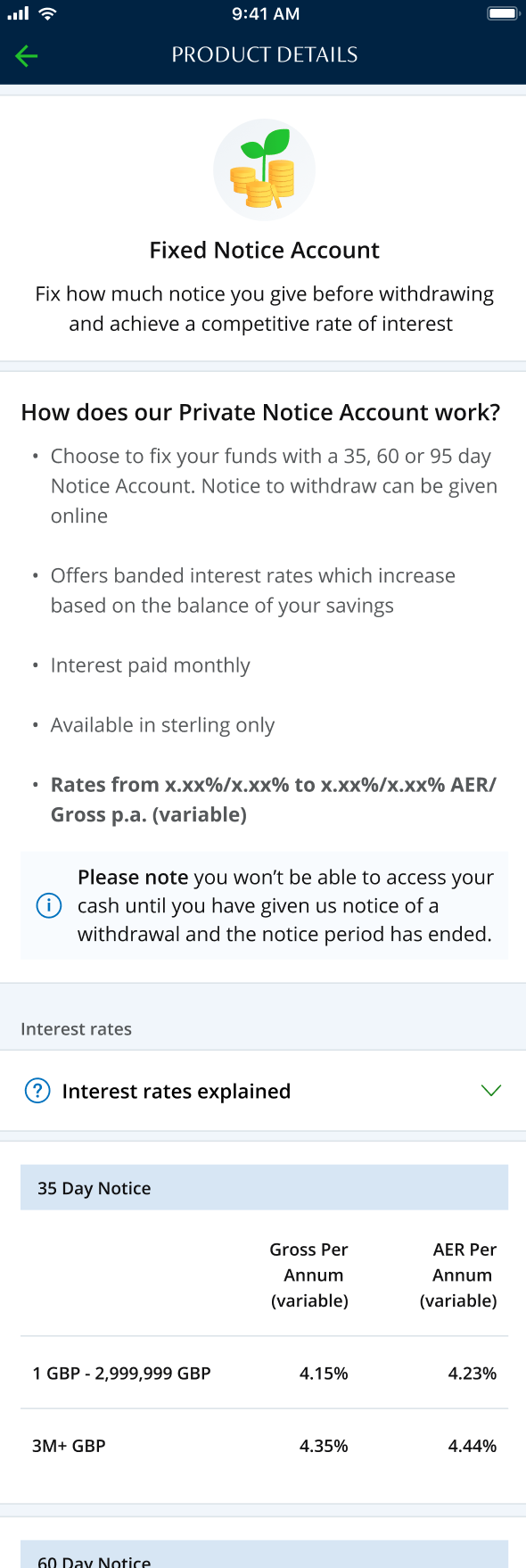
Banded by notice period (how users think) not product (how the business thinks).
Some details blurred for confidentiality.
Screens 1-4: reused from existing journeys. Screens 5-8: redesigned for Consumer Duty compliance.
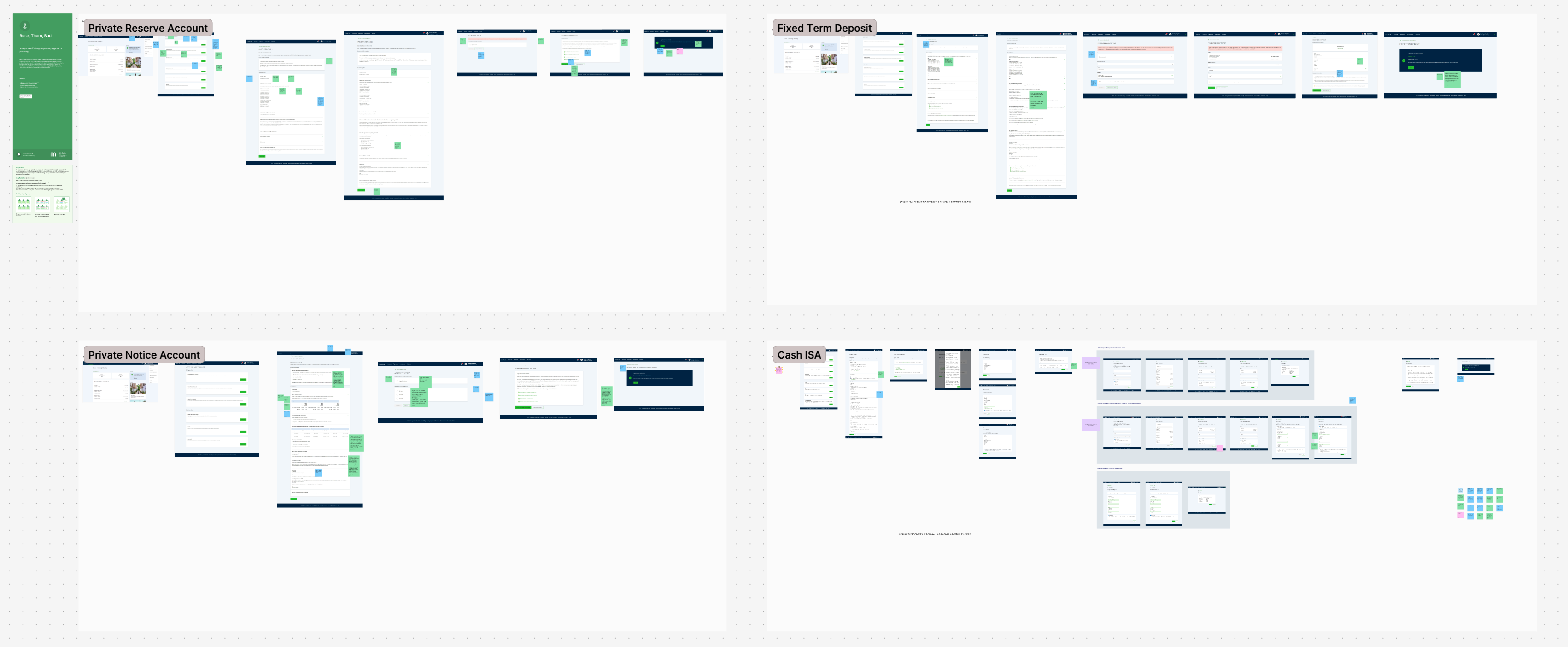
The consistency tension
The redesigned summary box was better. But it was also noticeably different from the Fixed Term Deposit, the Private Reserve Account, and the Cash ISA, each built at different times but recognisably the same product family.
In private banking, consistency across products isn't aesthetic. It's structural to trust.
Clients who've navigated one savings journey bring that mental model to the next. When something looks significantly different, it reads as different. At the point of committing money to an account, that uncertainty can cost trust that was never meant to be questioned. Consumer Duty required meaningful change; the existing product family required meaningful continuity.
Some details blurred for confidentiality.
The resolution
The answer was calibration. Some changes were non-negotiable on comprehensibility grounds and low-disruption in terms of visual similarity: those went in. Others would have improved the journey but produced visible divergence from the other three products: those went into a documented list, ready to be brought forward when the whole savings range could be addressed together.
The resulting journey made meaningful improvements to how terms were presented and explained, while remaining clearly part of the same product family. The numbers confirmed the direction was right.
balance growth in the
12 months post-launch
acceleration in growth rate
vs the pre-digital period
private banking accounts
opened digitally from zero
In private banking, account volume is not the metric. Each client represents significant assets under management; 739 new digital accounts is a material commercial outcome for a bank of Coutts' scale.
The digital channel has since become embedded in Coutts' savings strategy, contributing up to 30% of total balance growth. Balances have been sustained at approximately 85% above pre-launch levels despite market-wide outflows. The results weren't a spike.
The shelved work didn't disappear. It became the starting point for a cross-product workshop and, from that, a prioritised backlog for the whole savings team.
The one thing that didn't ship
Funding mid-journey was proposed and didn't make the launch scope. The case for including it was clear enough that it went straight to the top of the backlog.
Research consistently shows that users are significantly more likely to deposit money into a savings account at the moment they open it. Leave the account empty, and momentum drops away. The account sits unused and is often forgotten entirely. An empty savings account generates no revenue, skews product data, and starts the client relationship on weak footing. Including a funding step inside the opening flow was the right call commercially and experientially.
Budget constraints pushed it out at launch. It sat at the top of the backlog immediately after.
Consumer Duty is often treated as a compliance requirement to satisfy. Working closely enough with legal to find where genuine flexibility existed was the interesting part.
Read the primary sourceLegal teams don't always know where a regulation gives room. Reading the actual Consumer Duty guidance rather than relying on existing briefings opened up a better design that was still legally sound.
Consistency is a trust constraint, not just an aesthetic oneIn financial services, clients' confidence that they're dealing with the same institution is part of the product. Knowing when not to diverge is as important as knowing when to push.
The shelved list is a design outputDocumenting what couldn't go in and why gave those ideas somewhere to go. They resurfaced as inputs for the cross-product workshop that followed, and shaped what went on the savings backlog.
A note on confidentiality: screens have been kept at low resolution and some details generalised.